Saturday, 30 May 2015

Tex 1 Part 5/Assignment 5 preparation - Theme book - trees continued

So, work continues on the theme books. I have been photographing trees as you may have noticed if you look at other posts (and I guess that if you want to see all the tree work together please select the 'trees' items from the labels). There is also the ongoing work on the sketchbook assignment I chose to do alongside to try to get into drawing on a regular basis (unfortunately that is less successful as I juggle work and feeling tired when I get home in the evening, nevertheless, have a look at the sketchbook post for updates in that area).

Here are some pictures of my theme book I progress, the paper for the book have been sewn together and I am now working in it, the binding is still to come:


Some of the work in the theme book are just free doodles to warm up in the hope that some will be useful of give a feel of the idea of trees, whilst other are based on photographs I took:


I also made a small concertina sketchbook to take me to my art group. There is a very beautiful churchyard around the hall we use, and I sat there one evening painting trees, whilst a parent bird was busy feeding her young, there was much commotion above.

The front of the book to set the scene:


I looked at a large looming yew tree, which in life is very dark, but I had a go at a very wet on wet picture which rendered it quite light, but it is effective. I liked the wet on wet; I found that you have to work very quickly and be sure you put the same level of paint on across the page, otherwise it gets too overloaded and it knocks out the proportion of the pigment. I am a beginner in watercolour, but enjoy it once I get going. One of my art group colleagues thought the light in this was good.


Here's an attempt at stitching a tree into prepared mulberry paper:


Since the yew tree picture worked so well, I thought I would do one on mulberry paper and the stitch onto that - so here's the prepared paper:


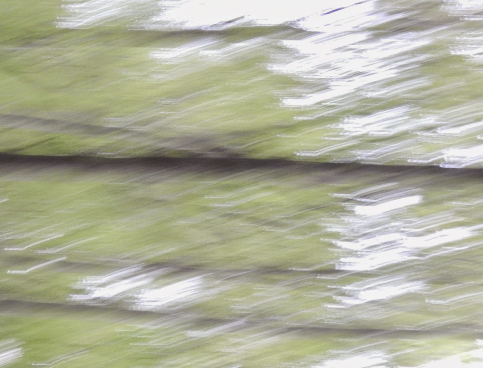
I went out one evening and took some photo of leaves moving in the wind. Then I have selected details so that mostly they become mostly abstractions.

First a picture showing three different trees growing in a roadside hedge area: oak, ash and birch


The next images are of details of leaves, areas where light shone through, where the camera was moving and the leaves were fluttering, and more detailing. Some of these pictures work quite well as single, or individual, pictures. Too many in a series and they start seeming a bit too similar. I guess a useful exercise would be to print and cut up some, try to draw or paint others.


This one is quite interesting - the edges are harder - you can tell the organic nature of the tree, but the lines have become edgy and sharp in the detailing and in the sharpness of the light. There is something a bit collagey about it.


And I really quite liked these. You get a sense of the moving leaves, the wind moving things about, and yet, they might be something else - the light in the greens and the organic lines make them a bit otherworldly.


I don't know why, but recently I 'rediscovered' Pipilotti Rist. the video art film maker. She had an exhibition in London I saw some years ago, and there are interesting film excerpts and interviews with her on Youtube that are worth looking at. She works in film to capture all elements of sensual experience - vision, sound and there is something quite aesthetic about her films, whilst also being a bit grating at time - creating a tension to keep you alert to say, the poison in Paradise. Whether her art is feminist is open to discussion, she uses the female form in her work, but then that has a long art historical tradition; I think it is likely that she is more concerned about notion of pleasure and feeling. There is a lot of water, fruit and other coloured things moving across very large scale screens, sometime projected onto ceilings for spectators to enjoy lying on the floor. The colours are enhanced and extremely strong, and as the images often go out of focus as she zooms in and out there is blurring, focus and blurring in continuous movement.

In getting a bit into photography when thinking about the life of trees, and I think this last picture here evokes something along the lines I mean, I may have remembered Rist's work for its intensity of colour and life, and the constant movement and sounds she brings to her films. Photography by contrast is still and fixed, it captures a moment rather than being a movement over time. You can create aesthetic effects with photography that also evoke feelings, but they are not accompanied by sound, so as the spectator you may only have your internal monologue to rely on when looking at it.

Monday, 25 May 2015

Tex1 Project 9 - samples in tapestry weave

The tapestry section sets out firstly to teach us basic techniques, and secondly to explore different materials experimentally within the tapestry language. I have done a little tapestry weaving before, so I have tried to get through the first sample quickly, using the materials I had at hand, rather than working too hard a colour choices etc.

First techniques-based sample in progress:

 
I have not designed anything onto the warp, but am developing a sort of system on the hoof, using yarns that are at hand. This picture shows some new things I have already learned such as eccentric weft and variations on pick and pick, but I also wanted to test the white linen as a warp - this is strung double for strength, but it is not of much value with the yarns I have used here; what I mean is, it is not visible and the linen would be good to use in a piece where the warp could be shown. By creating a border I am practicing joining, which is looking good so far. I have joined the border on every three passes and this is just right for the thickness of the yarns being used. The other thing that is being tested here is the use of knitting yarn. Apart from the linens (there is a natural medium thick linen in soumak which is not visible in the picture) the wools are all fairly open spun, soft yarns. These are not usually good for tapestry as they lack the body of a robust weaving yarn (often the weight of the wool fibre will be higher), and I predict that the final piece will be a bit floppy. The other thing I am accidentally testing here is weaving without starting a row of knots. I was taught to use a row of knots as a foundation for a tapestry, but I was watching a film while I was warping up to start, and clean forgot to set the foundation straight. This will probably be a problem when I cut the sample off, we will need to see.
 
Further work on the techniques sample
 
Here you will see that I added another border after I had done the pick and pick, and the row of knotted dots. We are also asked to try out the ghiordes knot, which I learned as a rya knot when I was a child, using a ruler to ensure equal length of each tuft. In Denmark in the 1970s it was fairly popular to have a rya rug in the living room under your coffee table. We had one, and my friend's parents had one. They were usually in a geometric patterns, and you can now buy these as 'vintage' items. Back to the sample; I added the knots in the centre and decided to add into this another contrasting colour (wool dyed in onion skins) to create a bit of life in the sample. The knots are made of four strands of hand-spun wool, a fine blue cotton, first another space dyed wool, which I later replaced with a space dyed hand-spun silk. I like the knots very much (surprisingly as I do not care for hairy carpets and felt ambivalent about the rya rugs of the 1970s), but they work well here in contrast to the flat weave of the rest of the sample. Right now I am not sure how to finish these sections of knotting as I approach the last section of the sample.
 
 
 Here's the final sample
 
 
Overall it is a useful sample, it suggests a design that might become a rug - but then there is a direct line between the flat weave of tapestry and for example kilim rugs and knotted works, so probably not surprising. I still like the shaggy bit, it makes the surface interesting. The band at the bottom works in connection with the colours in the pile, and the bright hidden centre gives a sense of something to be revealed. There are also things to learn from this though. Compositionally I do not like the three borders where they meet in the top corners. They look too straight (a bit like op art) and of a different aesthetic to the lower sections which are more 'craftsy'. You can also see that the warps have spread and the piece is slightly pushed out towards the top half. This is likely to be because I used thicker rug yarns that may have expanded the spaces between the warps.
 
I made a diverting sample of needle woven yarns on an open weave onion bag
 
 
Running stitch is a bit like weaving, moving the needle up and down through the fabric. The yarns made the fabric more robust-feeling, and the browns to blues to greens all have affinities.
 
 
Samples using different materials as weft
 
After the techniques sample we are asked to create a sample using unusual materials. I made two samples to try different things out. I experimented with creating a paper yarn using narrow strips of tissue paper and spinning them on the spinning wool. These were then plied into a two ply. This paper yarn was then used in a  soumak line in the 'grey' sample.


The small ball of yarn on the right here is the home made paper yarn, to the left some plastic which is highly adhesive. This came off some new frames and is used to prevent damage to the frame in transit. It was not easy to weave, in fact it was a pain to weave through the cotton string warp.


Here's the sample using the plastic 'yarn', the paper yarn and I also used a ripped polyester scarf as well as a plasticky ribbon. Both sections were woven double, but the section right contained the outer seam of the scarf so it was a bit less dense as a weft than that on the left. This makes the 'beads' of the weft smaller and denser.

 
Next, the other sample, using natural fibre yarns, including nettle yarn woven in double floating wefts to show off the fibre better,  elastic bands, sisal string, wool, cotton, linen and a cotton tubular knit yarn lain in as a floating weft with the hand-spun white wool-mohair towards the top. The final weft was a coarse un-dyed linen. At least these samples allowed for the warp to show. the one above used a cotton wrapping string, the bottom one used the double linen used before. Both warps were quite hard on the fingers but they look quite good.


The back of the sample shows how I have finished the sample, by weaving in the warp threads. This was a technique I learned from Fiona Hutchison, the Scottish tapestry weaver, and which is described in Joanne Soroka's book (2011). This way of finishing makes a neat edge and allows for the sample to stand proud with no distracting knots, frills or any other loose ends.
 
I thought I might also manipulate a picture of the weave to create something separate and unique from the structure


As you will see, there is a something suggestive of shells in the curves of this picture, and that points to the final sample I have been pondering for a while.

Final sample

I have thought quite a bit about the final sample, as I have for a while wanted to try out a technique in soumak that I explored in a class under the tapestry weaver, William Jefferies, a couple of years ago. At the time I made a small sample, but I have often thought that it might be used in different ways for different types of expressing a particular form, and in various scales. For a first 'proper' sample in the technique I wanted to use the lines and shapes of shells. I know that shells are a favourite source of designs for textile people, and I think that this might be because they have simple organic shapes that are harmonious in their proportions and they are useful for repeats as well as single shapes. Anni Albers (1965) used shells as an example of a design source in her book on weaving design, and this might also have spurred others on to looking at shells in their work.

In any case, the final sample is unlikely to look like shells, but will contain some essential elements of the shell texture. In preparation I have spun some silk and plyed it with wool. Well, at least some was wool, Wensleydale wool, which I love for its hairiness, its sheen and its smoothness, but I also had some packs of a mixture of alpaca, nylon and merino fibre, so that was also part of the ply in some of the yarns.


Here are some of the yarns I spun - the bottom one is unlikely to be used in the shell sample as it contains a purple silk ply that contrasts too harshly with the smoother yarns, and shells have essentially very smooth surfaces. The soumak technique, as it will be applied in the sample, will allow for the yarn to be seen in its substance, so that the plyes should be visible and the shininess of the silk be apparent to evoke the pearly surface of the shell. I have also not decided what the colour will be of this, I may play with Paintshop Pro and see what colours can be derived from the cream notes in the shells.
 
 
A couple of shells I have looked at came from some strange spoon type objects left by my grandmother. They are quite large and very smooth. The handles have been removed as they were broken and unsightly. What is not so clear on the pictures is that one shell is very concave, while the other is shallow. The technique I will use will work on the relief of the surface of the tapestry, so the curve of the shell will be represented in an undulation of the surface of the piece.


These last two shell pictures show the softness of the lines in the shell surface. There are lines running along the shape of the shell in two directions - from the place where the shell would have been attached to its counter part out towards the peripheral edge, and a set of soft curving lines following the lines of the shell's roundness.


As you can see the shells have a warm orangey creamy colouring on their outer sides, and on the inside a whiter more grey tone. In the concave shell there are iridescent greens and pinks. The wool-silk yarns are naturally cream-white so perhaps I should not manipulate the colour of these, but this is something I need to think further about as I work with the photos of the shells some more. I find that I am not usually good at staying within a monochrome range and almost always end up adding colour in some way.

Oh dear, I made a sample to test the materials in the construction of the shell sample and have decided I no longer want to make it! The delicate sense of the shell's surface is not at all captured in the weave - this is probably due to the tightness of the ply in my spinning as well as some of the wools I added to the blends. In any case I will not do a shell design for the final sample. The final sample will have its own entry in  a separate post.

 
The sample in preparation for the final sample. Some plain weaves, eccentric wefts and clusters of soumak increasing in bulk to create an undulating surface. The intention was that the relief effect would be created in two sections, leaning to left and right, but I no longer think that the soumak properly shows off the silk/wool yarn I spun. In fact, the top part of the sample is better, a section with some floating wefts of the silk-wool yarn and some single lines of coloured yarn. But this is not enough to sustain the last sample, I wanted it to be the relief effect that was the focus, so I will do this, but choose greens instead and consider it as pre-work for my final assignment in project 10.
 
 
Here are a couple of pictures of the  piece at different angles to try to show the relief of the lower half.


Here the starter row of knots can be seen in more detail.
 Reference

Albers, Anni, On Weaving, Wesleyan University Press, 1965
Soroka, Joanne, Tapestry Weaving: Design and Technique, The Crowood Press Ltd, 2011 

More exhibitions - open studios and degree shows

Open studios

It is that time of year again - the artists and arts organisations in my area open their doors to visitors, and this gives you an opportunity to look at what they are now doing, whether they are changing direction or in some other way showing new works.

With limited time I try to find places to go that show several artists at once. This means you can cover more work, that going to someone's house, and spares you any embarrassment that might be in being a single visitor and finding the work uninteresting.

There is one small group of three artists who show together every year, who hold their exhibition in a very beautiful place that alone would draw me there - the sun was shining, it was warm and the grasses, meadow flowers and birds all evoked the height of spring. The three people are respectively a flower painter, a ceramicist and an architect who is a talented water colourist. I like the variety of their work and they are good at showing both shared projects and individual works.

The combined exhibition of a work or two by each artist in the scheme is quite comprehensive. However I do find the work a bit patchy, the good work is still good but the bad is surprising, because you wonder how this work was passed for the show, I am not sure they have an assessment panel to select works, it seems as if everyone who wants to join gets in. So, maybe one day......

I took one useful thing away from these shows this year - I decided to learn a bit more about water colour. Look at Isabel Carmona's watercolours I liked the way she uses colour and then defines shapes with pen afterwards. I had a go with some drawings later in my work on trees. Another useful thing that I found was a small display of shared sketchbooks shown at the local museum. Here the sketchbooks were themed and a number of artists and contributed work in a defined period of time. That meant that each small book had a number of different styles in it, and one on the idea of text and texture had a contribution of text and scribbles drawn on acetate and then layered across coloured paper and other similar acetates. A useful technique to try.

UCA Farnham  Final degree show

I also went to Farnham to the art college there to see what the textile students had on show for their final degree show. usually I go to Winchester School of Art, but this year I seem to have missed it and besides, I like Farnham and the school there, and the Crafts Study Centre had a textile exhibition on which I wanted to see.

The school runs courses in textiles for fashion and interiors and the foundation degree in hand embroidery under the auspices of the Royal School of Needlework. The first display ranged from traditional weavings to contemporary prints, using computer designs and texture puff printing dyes. I liked the traditional weaves, there was ones collection in particular that looked as if the dye was natural and the weaves textured. I know this is probably a conventional things to say, but I feel relieved and encouraged that some young students are embracing the hand woven as their own, and uses it for a contemporary language. I did like the puff printing on computerised designs, but actually, when I got to the second student's use of this technique I did wonder how differentiated you could get using this material, the raised surface is interesting, but I did not see a strong diversity in the use of it.

Sadly there were not many visitors to the show - I guess a bank holiday Saturday is distracting for most, but there were many people shopping in town, so one might have wished for the students that more would have come to the show.

The hand embroidered collection of work had some stronger pieces in it. I liked the framed pieces of translucent fabric with long running and seed stitches made in fine hand spun wools and silks. There were also pieces looking at using hand embroidery in jewellery and white work, which is quite delicate. I often wish I was more inclined towards the tonal qualities of white work and I have been planning to do something on tones and texture for the final sample in the weaving project so it was good to be reminded how this work can look. There was also a work looking at textile and memory. I know this might sound a bit philistine but the memory paradigm in textile art is now so well-worn that many themes under this heading seem stereotypical and uninventive. There are/must be many other feelings and thoughts that textiles can evoke that need not be about personal subjectivity - grandmothers and mothers. I guess that is why I prefer expressive textiles about the stuff of textiles art works rather than works that aspire to speak of the deeply personal.

After the textile displays I popped in to look at the ceramics and glass work. Here I particularly liked some bottles standing on inverted wooden cones and some white balls of glass with transparent interiors of small balls of coloured glass. The opaque white exterior was then removed in a long line to allow the viewer to peer into the core of the work to see the coloured core.

TRAUMA, GRIEF, LOSS: The Art of Bereavement - Craft Study Centre

Around of the corner from the college lies the Crafts Study Centre, which houses a couple of small galleries that are often worth visiting. The exhibition was on the theme of bereavement, and yes, some statements about personal loss and the memory of lost family members were on show, some of it made in a narrative form, others abstracted. There were a series of photographs aiming at something bigger: textile remainders from dramatic deaths or accidents, heart attacks, seizures - the pictures showed stains and marks from bodily fluids and there was something visceral and human about this. These pictures were not about the made object but about the physicality of loss of human life, which evoked something more than just the bodily death. It was not a personalised statement, but spoke of the way we will all go and reminds us that we will not always be here as living, breathing bodies, although we are also more than that.

I recently went home to see my parents. My mother was very keen that I take stuff back with me, stuff that had belonged to my grandmother. My grandmother was an aspirational person who followed the Danish tradition of collecting bottom drawer stuff, including a pile of silver plated cutlery which I am not sure to whom she was collecting, as my mother was a single child living abroad at the time when she collected all these things. She was also an accomplished needle woman and knitter, but the stuff we were looking at were these forks, spoons, teaspoons. My grandmother died many years ago, but what this meeting of her objects reminded me of more than anything is her disappearance as a person in body and in mind. When my mother and I are no more she will be forgotten - and so will we eventually. It is a difficult to think about - of all those people that came before us, only a handful are remembered. In history we remember the politician, the general and the king, not the farmer's son who battled it out on the field; we see the opulent brocade dress worn by a duchess in a painting by a famous artists, but not the hand of the seamstress or wigmaker who made these things.

So what I am trying to say I guess is that creating a memento mori for a deceased son, as someone had done in the exhibition, is a way of holding on to that person in a personal way.
I think this is a very personal thing, and I feel ambivalent about how these things are made so public.


Sunday, 17 May 2015

Recent exhibitions visited - May

Emil Nolde - Nolde Stiftung, Germany

I mentioned in another post that I recent visited the Nolde Stiftung in Seebull, northern Germany. This is a wonderful place. When Nolde died the collection of his art work was left to a foundation that now house his works and present them, I think, on an annually rotating display to show different work every year. This is great, it means that the watercolours are protected from excessive light, and it means that visitors get to see a fresh display if they return.

Last time I was there was perhaps 7 or 8 years ago. Since then the Foundation has build a splendid new modernist building with a big shop, a good restaurant and educational rooms. We spent the first hour there viewing a documentary film of Nolde's work before going to the dislays themselves which are shown in a building Nolde designed and had built in the late 1920s. Here's the Nolde house seen from a small patch of garden, which in early May does not have many flowering plants in it:

 
The exhibition was very good. There was a large room of oil paintings, landscapes, flowers and still lives. A room with some cabinets showed Nolde's designs for small cushion covers which his wife had translated into diagrams for knotted weavings, which was quite interesting as the work of his wife, Ada, as his companion and support, is otherwise not visible in his work. There were rooms with watercolours and a good selection of his ungemalte Bilder, the small watercolours he painted during the war when his artistic 'licence' or rights were removed by the National Socialists as his art had been seen as 'entartet' i.e. the Nazis thought his work degenerate. The large 'altarpiece' of a crucifixion and other paintings with religious motifs were also on show, as were a series of great watercolours of flowers which he is so famous for.
 
So, there was plenty to see and reflect on. Nolde was clearly absorbed by romantic notions of the land and nature, of a spiritual connection of the person with the forces of nature, the land, the weather, the sea and the life of plants. There is something otherworldly about his flowers, there are big blooming poppies, but they are not those exact poppies in the garden, although he may have drawn on them, but they are Poppies in nature or life beyond the real of the earth they grow in. His skills in watercolour were great, so simple is the application of colour to a wet paper that colours mingle just enough, but not too much, and you can detect in some of them an interest in Japanese aesthetics maybe, in his compositional approaches. Anyway, I enjoyed the visit and would suggest anyone visiting Schleswig-Holstein take a journey there, this art is a gift to the world.
 
Magnificent Obsessions: The Artist as Collector, Barbican
 
The second exhibition I went to see in May was the Magnificent Obsessions: The Artist as Collector at the Barbican. This was a selection of collections by British and North American artists, divided into displays based on each separate collections. Overall I found it interesting, and there were some beautiful and precious objects on display (Howard Hodgkin's amazing Indian paintings from the 16th century), there were scientific books and surgical models and illustrations from the 18th century (Hiroshi Sugimoto's collection of Enlightenment items) and kitsch pop art objects such as cookie jars (Andy Warhol), record sleeves, amateur paintings and mass produces silk scarves. Each artist also had one of their work on show which seems to have been selected by the curators to resonate with the collections. Thus Damien Hirst had a display of pinned butterflies in a large framed piece, Edmund de Waal showed a piece called from the collection of a private man (2011) and Sol Lewitt's photo series hung near his collection of Japanese prints and historical art photographs.
 
The concept was interesting; here were artists whose works were clear inspired by things they harboured in their homes in their collections. Some seemed to be purist about their collecting habits, selecting only the best, and indeed being selective about what they would draw in to their collections (Hodgkin's paintings and Arman's African masks and other face/head gear, while others were truly obsessive and seem to have collected indiscriminately from within a category of objects such as the strange collections of kitsch Chinese stuff that did not seem to have a remit other than they were from that ethnic culture in the US.
 
I felt there was one large gap in the display: why did the curator's not show how the artists lived with their work, or how they displayed this in their private spaces? Some of these collections suggested compulsion of acquisition and suggested that perhaps the objects were collected in such large quantities that they have been a problem (not far form the compulsion of hoarding some people suffer), and some collectors display with pride their objects, or as the exhibition suggested, some artists used their collections was inspirational routes into their work. Showing a selection of objects form a collection in an otherwise white empty space may disguise the actual volume and density of the setting in which the artist-collector lives with their objects.
 
I also think that since there were only to women artists shown in the display it might have been interesting to think about whether there is a gender dimension to the collecting habit. The majority of artists' work in the display were men, and although I have eluded to the differences in collecting habits they showed, I wonder whether there was something else to be said about the nature of collecting that was missed here.
 
Edmund de Waal's collections seemed a bit out of place to me - yes, he has two collections of smallish objects of great value to him in his work, but they were both inherited. The first collection was a series of stones, shells and other small objects a vicar had given him when he was a child, the other collection is the netsuke collection he inherited from his uncle, and which he has written about in his book, The Hare with the Amber Eyes. I am not completely sure de Waal actually adds to these collections from his personal perspective. His ceramic work feeds into other people's collections, and he works on series of objects and maybe that is what his own piece on display alluded to. But in all the other cases on display the collections had been personally conceived, developed, added to and worked on to create very particular wholes, of series or of jumbles, but nevertheless very personal collections.
 
When you are given collections can you really be said to be a collector, or are you more a custodian and curator of someone else's series or jumble? And what does it mean when a  collection  is curated anyway, especially as it was in this exhibition? What meaning did the artist-collectors have in gathering this stuff to themselves and what happens when someone else selects form this and tries to interpret this? Although an interesting display of glimpses into a world of looking and holding objects, I think a bit more work could have been done to place collecting in a wider context than the solely personal level we briefly shared as visitors to the exhibition.

Maybe I should admit to be a bit of a collector-hoarder myself? I have a substantial collection of embroidered table cloths, tray cloths and other linen. Most of it is not great works of art, but there are some very good pieces, and I have an amazing Danish arts and crafts table cloth which I can recount a great tale of finding and treasuring. I also did a bit of work on collecting once for some written work and read a small article by Walter Benjamin where he speaks exactly of this pride in finding a wonderful specimen (he collected books) at a particularly good price, or containing a somehow unique quality. But something can happen when the collection takes over, in terms of volume and value: you need to start investing in all manner of conservation materials to preserve the pieces, and you know that no-one else will have the same feelings you had in treasuring the collection, so how will the things be treated if you were unable to pass it on in trust? I haven't seriously thought about whether anyone might be interested in some of the better pieces, but have been thinking that it is probably time to start making something from the lesser quality items. The linen is still good, even if the lazy daisies are boring or faded, so maybe something useful and contemporary can be gained from this?

Friday, 8 May 2015

More trees - spring in the North

I had a holiday recently, went to where I grew up which is a quietly beautiful place. It is very green and fertile, there is much agriculture and many old villages. There are ancient remains of Neolithic and later burial sites in small but pretty woodland areas. So I had a great time photographing between family visits, shopping and a trip to Germany to visit the Nolde museum in Seebull.

Here are some of the images I took, some of them have been cropped or I played with the camera to get shaky abstraction.

The beech tree is a common woodland tree there


It was one of those springs where the sun shone warmly, even between the showers


I am not sure how clear it is on this picture, but there was a long barrow lying in the woods here


Oh, and this one is from near where I live in the UK, taken a bit earlier in the year to capture shapes of branch development


On the theme of cultivated trees, an orchard in bloom


Just to show how trees fit into the pastoral views of a local village with a thatched windmill and church in the line of sight.
 

And some of those abstracted images I cropped to select interesting light cast over the green of trees:


Although this one is slightly blurred I was very happy to be able to photograph a male blackbird in full song. Where I stood there were at least four of them busy claiming their corner for their own

 
This male started getting a bit cautious once he heard the camera bleeping, he flew off soon after
 
 
I have not included many images that showed wood being used. On traditional thatched roofs wooden blocks keep the thatch in place
 
 
I will write about the Nolde exhibition in a different post, but will here show some picture of a wetland area not far from the museum. That part of the northern most region of Germany is very flat and exposed to wind, but it then allows for these large spaces to be created to enable birds to stop over in their migration

 
And so, as we stood there looking at the land a gang of geese landed.....


The land has been won from the sea using dykes and drainage, and the mounds of earth now grown over with grass is good feeding for sheep

 
On my last day the weather was quite dramatic weather, the clouds did eventually blow over and left some fine views over the sea. I realise I have taken a lot of pictures of landscape as well as trees. What struck me more than anything on this visit was how beautiful the place is where I grew up. The sea looks different depending on the weather - obviously - but there are also different coastlines, some just pebbly beaches, beaches lined with woods and coasts with fields and trees. When I grew up, and on many visits since I didn't really realise how nurturing this landscape is.


Monday, 20 April 2015

Study visit - Sonia Delaunay at the Tate Modern

A weekend in April the OCA had arranged a study visit to London to see the Sonia Delaunay exhibition at the Tate Modern. And it also happened that it was the last day to see Sheila Hicks' work at the Hayward Gallery. So off I went, met up with fellow students and wandered about the exhibition and further galleries to study abstraction, colour and application of art to/with fashion and design.

I knew a little about Sonia Delaunay's work before I went. I had of course heard of her and Robert Delaunay, but hadn't seen substantial amounts of it, other than when flicking through books. At the same time I know a little about Modernism in art and the Bauhaus and de Stijl in design history terms so felt reasonably prepared beforehand.

Anyway, the work was quite interesting, there was a lot of the Delaunays' interest in colour defraction and interaction on display, large target like circles, jazzy angular patterns and a very good display of her textile and costume designs. I enjoyed the show very much. My own work is more organic and maybe not inventive in the way the Delaunays and their contemporaries were. They were working with new theories of seeing and trying hard to look at new ways of seeing and representing things. It often feels now as if so many of these ways of seeing have already been seen, that so much work now is variations on themes, and personally I find it difficult to think anew about the textile material.

Of all the galleries in the display the very early representational work and the textiles ones were my favourites. I enjoy seeing how the artist used colour to try to find a new language of description. The gallery labels suggested Sonia Delaunay had been looking at Gaugin's work in her early works and this was apparent in the choice of themes and composition, young women from the countryside at the table for example, but not so many exteriors as in Gaugin, more a focus on the person in the interior. This interpretation may be due to the curation of the show. Maybe Delaunay did paint outside, but this was not very visible at The Tate exhibition.

The textile galleries contained many samples, films of models wearing garments made of the printed and embroidered work based on Delaunay's designs. The heavier woollen embroideries were very good, I liked the texture of the surface and there was an example of how she had used watercolour in a way that suggested stitch, with a stitched picture hung next to it to allow the spectator to make this connection. There were a lot of print design in books, on the wall, in drawn, painted paper designs with the printed fabric hanging alongside as examples in single colour ways. There were some costume designs and the costume itself made for Ballet Russe on an Egyptian theme with photographs showing them being worn. So there was plenty to look at and consider.

I think my work contrasts a lot with this work - my work is mainly constructed and I work with the organic form. Here was purity of line, geometry and dynamic colour divisions and selections that had been used quite intellectually to describe the modern life of an urbane culture. My work has not yet found a language of its own, but I intuitively feel that our own post-Modern (and I am using this term tentatively......) world is so diverse, so allowing of all manner of expressions that things are so complex now. Then there was a sense of direction for the French and German Modernists. They had strong progressive and radical purposes that gave meaning to their work. It was about the new, the clarity and purity of seeing and living; new materials and findings in science inspired them, industrial methods, speed and new ways of communicating gave them the impulse to see and make in new ways. I am finding it difficult to think about creating meaning now in a vast sea of meanings, but sense that there is something about custodianship and respect for people and environment that has become a necessity. In any case that is something to continue to reflect on as I work on my own things.

The Sheila Hicks work I have mixed feelings about. The display had three rooms; the first one you entered was a mixture of samples and finished work including a vitrine with wrapped batons in all manner of colours, a larger piece on hanging wrapped coiling elements, some of her wrapped 'cushions' and some samples including a section of the Ford Foundation embroidery recent re-made. In an adjacent gallery a few of her miniatures were on show. Mainly recent ones, and perhaps not all of the interesting ones. I like the ones were she has used shells and feathers, and overall I found it interesting to see the fineness of some of them, the wrapping in one of them was very fine. The seemingly freely created pieces look very fine when they are mounted in white and framed, it makes them seem quite delicate and unique, which they are, but this mounting enhances that sense even more.

The third room was a collection of large coloured cushions for the public to sit on. There was a film one could watch which showed how this type of display had originally been made for a much larger venue, and where the coloured cushions had been carefully composed through Hicks' direction. Here the colours were grouped rather than mixed, perhaps due to the smaller room. The coloured fibre inside each coloured 'pouffe'  was some sort of synthetic and it was held together by a fine synthetic mesh. Although a fun room for everyone, including families with small children I wonder what the purpose was with this work. We came late in the afternoon on a Sunday, so it was quite peaceful and you could sit quietly, as one couple plainly did, they seemed to be almost asleep. But I am not sure it did much more, it was almost like those coloured ball fun rooms for children in places like Ikea, which is an equally democratic play space. I am sure when the original display was created the intention of making an art work interactive was one of the driving forces. In a way then Sheila Hicks' work is almost reaching a purpose such as Toshiko Horiuchi Macadam's play spaces for children, allowing people to physically interact with the art work at a fundamental level. I guess it was about pleasure as well as about contemplation.