A weekend in April the OCA had arranged a study visit to London to see the Sonia Delaunay exhibition at the Tate Modern. And it also happened that it was the last day to see Sheila Hicks' work at the Hayward Gallery. So off I went, met up with fellow students and wandered about the exhibition and further galleries to study abstraction, colour and application of art to/with fashion and design.
I knew a little about Sonia Delaunay's work before I went. I had of course heard of her and Robert Delaunay, but hadn't seen substantial amounts of it, other than when flicking through books. At the same time I know a little about Modernism in art and the Bauhaus and de Stijl in design history terms so felt reasonably prepared beforehand.
Anyway, the work was quite interesting, there was a lot of the Delaunays' interest in colour defraction and interaction on display, large target like circles, jazzy angular patterns and a very good display of her textile and costume designs. I enjoyed the show very much. My own work is more organic and maybe not inventive in the way the Delaunays and their contemporaries were. They were working with new theories of seeing and trying hard to look at new ways of seeing and representing things. It often feels now as if so many of these ways of seeing have already been seen, that so much work now is variations on themes, and personally I find it difficult to think anew about the textile material.
Of all the galleries in the display the very early representational work and the textiles ones were my favourites. I enjoy seeing how the artist used colour to try to find a new language of description. The gallery labels suggested Sonia Delaunay had been looking at Gaugin's work in her early works and this was apparent in the choice of themes and composition, young women from the countryside at the table for example, but not so many exteriors as in Gaugin, more a focus on the person in the interior. This interpretation may be due to the curation of the show. Maybe Delaunay did paint outside, but this was not very visible at The Tate exhibition.
The textile galleries contained many samples, films of models wearing garments made of the printed and embroidered work based on Delaunay's designs. The heavier woollen embroideries were very good, I liked the texture of the surface and there was an example of how she had used watercolour in a way that suggested stitch, with a stitched picture hung next to it to allow the spectator to make this connection. There were a lot of print design in books, on the wall, in drawn, painted paper designs with the printed fabric hanging alongside as examples in single colour ways. There were some costume designs and the costume itself made for Ballet Russe on an Egyptian theme with photographs showing them being worn. So there was plenty to look at and consider.
I think my work contrasts a lot with this work - my work is mainly constructed and I work with the organic form. Here was purity of line, geometry and dynamic colour divisions and selections that had been used quite intellectually to describe the modern life of an urbane culture. My work has not yet found a language of its own, but I intuitively feel that our own post-Modern (and I am using this term tentatively......) world is so diverse, so allowing of all manner of expressions that things are so complex now. Then there was a sense of direction for the French and German Modernists. They had strong progressive and radical purposes that gave meaning to their work. It was about the new, the clarity and purity of seeing and living; new materials and findings in science inspired them, industrial methods, speed and new ways of communicating gave them the impulse to see and make in new ways. I am finding it difficult to think about creating meaning now in a vast sea of meanings, but sense that there is something about custodianship and respect for people and environment that has become a necessity. In any case that is something to continue to reflect on as I work on my own things.
The Sheila Hicks work I have mixed feelings about. The display had three rooms; the first one you entered was a mixture of samples and finished work including a vitrine with wrapped batons in all manner of colours, a larger piece on hanging wrapped coiling elements, some of her wrapped 'cushions' and some samples including a section of the Ford Foundation embroidery recent re-made. In an adjacent gallery a few of her miniatures were on show. Mainly recent ones, and perhaps not all of the interesting ones. I like the ones were she has used shells and feathers, and overall I found it interesting to see the fineness of some of them, the wrapping in one of them was very fine. The seemingly freely created pieces look very fine when they are mounted in white and framed, it makes them seem quite delicate and unique, which they are, but this mounting enhances that sense even more.
The third room was a collection of large coloured cushions for the public to sit on. There was a film one could watch which showed how this type of display had originally been made for a much larger venue, and where the coloured cushions had been carefully composed through Hicks' direction. Here the colours were grouped rather than mixed, perhaps due to the smaller room. The coloured fibre inside each coloured 'pouffe' was some sort of synthetic and it was held together by a fine synthetic mesh. Although a fun room for everyone, including families with small children I wonder what the purpose was with this work. We came late in the afternoon on a Sunday, so it was quite peaceful and you could sit quietly, as one couple plainly did, they seemed to be almost asleep. But I am not sure it did much more, it was almost like those coloured ball fun rooms for children in places like Ikea, which is an equally democratic play space. I am sure when the original display was created the intention of making an art work interactive was one of the driving forces. In a way then Sheila Hicks' work is almost reaching a purpose such as Toshiko Horiuchi Macadam's play spaces for children, allowing people to physically interact with the art work at a fundamental level. I guess it was about pleasure as well as about contemplation.
Monday, 20 April 2015

Sunday, 5 April 2015
Tex 1 Assignment 4 Project 8 - reflections on constructed samples
This project ends with some questions on the process and materials of the project:
Q Did you enjoy inventing constructed surfaces? Were you surprised at the results? Can you see a connection between your choice of materials and the types of structures you made – regular, irregular, small or large scale? Which samples worked best – and why?
A These exercises were kind of interesting and challenging at the same time. I knit a lot, following patterns, and so do not usually ‘invent’ structures of my own, unless I do a bit of tapestry weaving or look a bit creatively at knit. That means that this use of yarn to freely assemble something into a synthesis to become a finished object can be difficult to think through. But I am fairly happy with the samples. I have also been studying the work of sculptural fibre artists and see that Ed Rossbach’s basket woven work is described as ‘improvisational’. Maybe that is what this work is all about – and I was working along on my woven/wrapped grid, looking at it occasionally when I saw a photograph of a Rossbach basket in a catalogue I have on mid-century American crafts (Museum of Arts and Design (2011)) where he seems to have been weaving open sections developed from any direction the ‘warp’ willows might fall in his construction, and there were quite a few coincidences in the way my own work was developing.
During the making of the samples (and especially these constructed ones) the work grows on you, and by looking at them over a longish period you start to see patterns and dimensions which can be built on. And yes, materials are crucial in this – whether they are shiny or matt, solid and dense, heavy or light. I have been looking at Eve Hesse’s work recently and am in two minds about it, however what is clear is that her focus seems to have been on process and materials and that she thought quite hard about the relationships between them. The fibre artists working around that time (1960s) also seem to have been focusing on structure and how this inter-related with materials, often on a very large scale.
So in a very small way I have quite enjoyed these exercises and got unusual results out of it. My husband joked that my ‘shield’ sample was a lacrosse racket, and that is the type of response you might expect from an untraditional piece, there is a search for something familiar in the unfamiliar; but I think the robust edges of that piece in contrast to the finer threads and small areas of woven patches worked quite well in the end.
The other grid piece is developing well. It is difficult to decide at what angle it will eventually look its best. It is being woven from various sides, and you get used to looking at it from one side more than another during making. As I mentioned in a different area, I enjoy natural materials, they have a great feel in the hand, I understand more about how they respond to processes (weaving, knotting, hanging, draping and so on), and they work well with wooden frames, and independent free-standing-hanging pieces such as the low relief samples in this project.
Hard materials such as thicker linens and sisal can be used in bigger pieces. There is much potential in these materials and they can be wrapped or hung with finer more shiny materials to create interest. If there is one think I find difficult in working in this sort of free and spontaneously constructive way it is getting a feel for when something is finished. I mean really finished, not almost, or overly finished and I am not sure when that point of balance comes. I prefer to work on something until I tire of it. With that statement I don’t mean getting bored with it, but more working on it until there is a sense of exhausting a certain stage and then putting it somewhere where it can be looked at over time until a new dimension becomes obvious and needs to be fulfilled.
Q How accurate were you in matching all the colours in your postcard: with paints?
I liked the colour matching exercise. Richter’s paintings are complex and have many, many different colours in them in different proportions, but I had a go, and found my final analyses useful. I used gouache and other water based media. Some of these mixes came out well, and overall I think gouache was probably the better media.
In any case there were strong colour themes in both pictures, green in one, blue in the other. I have quite a large yarn collection so could identify some good likenesses to the colours in the pictures. The charity shop is always a good source for embroidery yarns and crewel wools, and these wools come in all manner of colours, and I have collected a fair few bundles for weaving. What is equally important I guess is the quality of the yarn, alongside the colour, as a shiny, smooth yarn casts light differently from a matt one. This is important in textile design where the characteristics of the materials is one of the key factors I how the work will look depending on the techniques of making.
Q Did you enjoy inventing constructed surfaces? Were you surprised at the results? Can you see a connection between your choice of materials and the types of structures you made – regular, irregular, small or large scale? Which samples worked best – and why?
A These exercises were kind of interesting and challenging at the same time. I knit a lot, following patterns, and so do not usually ‘invent’ structures of my own, unless I do a bit of tapestry weaving or look a bit creatively at knit. That means that this use of yarn to freely assemble something into a synthesis to become a finished object can be difficult to think through. But I am fairly happy with the samples. I have also been studying the work of sculptural fibre artists and see that Ed Rossbach’s basket woven work is described as ‘improvisational’. Maybe that is what this work is all about – and I was working along on my woven/wrapped grid, looking at it occasionally when I saw a photograph of a Rossbach basket in a catalogue I have on mid-century American crafts (Museum of Arts and Design (2011)) where he seems to have been weaving open sections developed from any direction the ‘warp’ willows might fall in his construction, and there were quite a few coincidences in the way my own work was developing.
During the making of the samples (and especially these constructed ones) the work grows on you, and by looking at them over a longish period you start to see patterns and dimensions which can be built on. And yes, materials are crucial in this – whether they are shiny or matt, solid and dense, heavy or light. I have been looking at Eve Hesse’s work recently and am in two minds about it, however what is clear is that her focus seems to have been on process and materials and that she thought quite hard about the relationships between them. The fibre artists working around that time (1960s) also seem to have been focusing on structure and how this inter-related with materials, often on a very large scale.
So in a very small way I have quite enjoyed these exercises and got unusual results out of it. My husband joked that my ‘shield’ sample was a lacrosse racket, and that is the type of response you might expect from an untraditional piece, there is a search for something familiar in the unfamiliar; but I think the robust edges of that piece in contrast to the finer threads and small areas of woven patches worked quite well in the end.
The other grid piece is developing well. It is difficult to decide at what angle it will eventually look its best. It is being woven from various sides, and you get used to looking at it from one side more than another during making. As I mentioned in a different area, I enjoy natural materials, they have a great feel in the hand, I understand more about how they respond to processes (weaving, knotting, hanging, draping and so on), and they work well with wooden frames, and independent free-standing-hanging pieces such as the low relief samples in this project.
Hard materials such as thicker linens and sisal can be used in bigger pieces. There is much potential in these materials and they can be wrapped or hung with finer more shiny materials to create interest. If there is one think I find difficult in working in this sort of free and spontaneously constructive way it is getting a feel for when something is finished. I mean really finished, not almost, or overly finished and I am not sure when that point of balance comes. I prefer to work on something until I tire of it. With that statement I don’t mean getting bored with it, but more working on it until there is a sense of exhausting a certain stage and then putting it somewhere where it can be looked at over time until a new dimension becomes obvious and needs to be fulfilled.
Q How accurate were you in matching all the colours in your postcard: with paints?
I liked the colour matching exercise. Richter’s paintings are complex and have many, many different colours in them in different proportions, but I had a go, and found my final analyses useful. I used gouache and other water based media. Some of these mixes came out well, and overall I think gouache was probably the better media.
Q with yarns/other material?
Saturday, 4 April 2015
Tex 1 Assignment 4 - Research point – the textile artist
This exercise
asks for a consideration of the textile artist in comparison to designers and
craftspeople; it then goes on to look at a couple of textile artists whose
work we admire or find inspiring.
It is probably not always that clear cut – artists such as Sheila Hicks started out as an artist (paintings), but was also a designer-developer of fabrics for companies such as Knoll (Simon (2011)). Her work was bought by corporate customers for their interiors, and her installation work inspired interior designers to create ‘environments’ for displaying goods. She has a great sense of material and colour, and technique is central to the expression. Does that then make her a crafts person or is her work art?
I am aware that the fibre art movement of the 1960s that Sheila Hicks was part of is seeing a bit of a revival with a retrospective of Hicks' work in 2011, major exhibitions of fibre sculpture and tapestry in the US and France (Porter et al (2014), Bellu et al (2013)). The artists who worked in this area were in many cases fine artists who had trained at art college. Some of them, for example Hicks, Magdalena Abakanowitz, Kay Sekimachi and Lenore Tawney subsequently learned weaving in workshops of cloth or tapestry weavers, and then, when key books on ancient techniques where published, they explored new ways of looking at ancient textile techniques using material experimentally and to a scale that I am sure would not have been explored much before.
The definition of an artist as someone concerned with concepts and 'grand ideas' is probably not completely accurate. Crafts people moving into the arts arena work with ideas, but using their technical skill and expertise to express this, whilst artists may have started in one area and then moved into another, such as textiles, but then they over time gain the skill and understanding needed for their chosen area. And some go as far as giving their work conceptual titles, which I sometimes read with some scepticism. Why suggest all manner of poetic allusions if what we are seeing is a beautiful piece of weaving? It is perfectly valid, I believe, to produce the textile in its own right and display it as a textile object, without having to legitimise it within the institutional discourses of art critics, galleries and art history and theory that carry such weight. The existence of the object does not necessarily become more meaningful by being placed within a language of theoretical constructs, but then there has for some time been a phenomenological strand in art theory that seems to place these objects within an 'otherworldly' experiential space.
Anyway, back to the two artists I will discuss here - I have chosen to look at the work of a modernist artist, Cornelia Forster (1906-1990), a relatively unexamined painter, print maker and tapestry artist who learned her weaving in the French tradition, and Sheila Hicks (b.1934), who comes out of the US based fine art sphere. Both use colour as an expressive medium, both use textile media, but one was not a widely know artist, and the other has had a long and continuing art career with a prominent profile in the art and textile world.
Cornelia Forster worked in various media, some of her work being quite interesting, some pieces looks a bit derivative to me, but it is interesting for its roots in French-Swiss Modernism, and she worked in various styles and techniques, including surrealism, abstraction, painting, drawing and sculptural abstraction. What I find interesting in her tapestries is that firstly, from an art historical perspective she worked early on in the style of French work, close to the work of Jean Lurcat, who played a key role in the revival of the French tapestry industry during the mid 20th century. Her work follows the tradition of wall-hung works, woven tapestries in the Aubusson technique. What dominates the web-site collection of her work linked here, are tapestries in colour harmonies following pallets of soft pastels for example in her flower compositions, but she also had abstract pieces woven into tapestries. Colour in the decorative flower tapestries is used very sensitively. The works look decorative and do not challenge any perceived notions of this medium, which may have something to do with her commissions, but they are woven to a high degree of skill and there is a keen sense of the tradition of the tapestry medium, with a strong mid-20th century aesthetic. Most of her tapestries have designs that cover the whole surface of the work, there is a lot of detail in some, and the designs are mainly vertical, whether the works are landscape or portrait. What I like about these works is their fairy tale quality. There is something narrative about some of them, figures appear in dense flowery jungles, or the spectator can dream themselves into fantasy jungles of vegetation.
I have to admit now, that there are very many good narrative tapestry artists to choose from, and that I chose Cornelia Forster because she is not well known and I think she should be more widely recognised, and secondly because I find her narrative representation interesting and suggestive, but know that this is not my own style. Hence I find the aesthetic attractive because it gives me something that I couldn't create myself. I see aesthetic affinities in Michael Hearld's illustrations and Klaus Haapaniemi's designs, and this is something that reading fairy tales evoke, the otherworldly, the mystical, the beautiful and sometimes the gruesome.
Now why would I then choose Sheila Hicks as my second choice, when her work is fully abstracted? Well, I got very excited about the fibre art movement when I first bought the book by Mildred Constantine and Jack Lenor Larsen, Beyond Craft: Art Fabric (1973). In it were photographs of these huge works in different techniques by a collection of textile artists, quite disparate, from different countries, but the ones that stood out where Hicks and Magdalena Abakanowicz. I had taught myself tapestry weaving 20 years before and here were works that I felt intuitively had informed the books I had been reading at that time.
Hicks' work was inspired by ancient pre-Columbian textile techniques. She improvised weavings on a small portable tapestry frame and had worked for industry as well as becoming an important exhibiting artist. Many of her works use wrapping techniques. She works on a large scale as well as her small miniature tapestries, but there was a sense of freshness to her work that may have looked at ancient techniques, but spoke with a contemporary language. Her sense of colour is interesting, sometimes she works with harmony, at other times with contrasts. Her work includes long strands of linen wrapped with smooth, lustrous silks, and more recently her work includes chunky wrapped cushiony bundles of fabric. She has also worked with embroidery and has used elastic bands, paper, shells and other unusual materials in her work.
Hicks has had a long career, and in 2011 she had a retrospective in the US. She works from a studio in Paris, and has several assistants to help. Not surprising really, she is not young but has been working since the 1950s, and she continues to exhibit. I read somewhere that she works very hard and her large body of work is there to show for it. I find her range tremendous, and from time to time look for examples of her miniatures on the web, and they seem to be exploratory inventions using fibre mainly in all manner of colours. So, although she often uses wrapping this technique provides openings for various ways of showing off the fibre. I am not always convinced by some of the names given to the pieces, I think they are strong in themselves, they are constructed structures, independent and complete things made of fine yarns. I also find other artists' work .from the same period (1960s) fascinating. The works in sisal and rope by Jagoda Buic, Abakanowicz and Aurelia Munos were to a scale and in forms that show real vision and substance of thought in making. They are about process and material and express something beyond themselves. I think these artists really understood fibre and what it could do and wanted to make significant statements about that. There is also much fine work coming from Japan, but due to space here I will just end by linking to fine pieces of string work that Toshiko Horiuchi Macadam made for children's playgrounds.
References
Bellu, Sylvie et al, Decorum, Paris: Flammarion, 2013
Constantine, Mildred and Larsen, Jack Lenor, Beyond Craft: Art Fabric, Van Nostrand Reinhold Company, 1973
Porter, Jenelle and Adamson, Glenn, Fiber: Sculpture 1960-Present, Prestel, 2014
Simon, Joan et al, Sheila Hicks: 50 Years, Yale University Press, 2010
In the
previous research points we were asked to look at the designer-maker, the crafts person and
textile design originating at the hands of designers for commercial textiles. Where textiles are part
of a crafts process the maker is integral to the process, working with a high
degree of skill when struggling with their chosen materials. There is a strong focus on process and the
materiality of the textile – and I would suggest that the line between craft
and art is a fine one and probably quite fluid, as it is a matter of emphasis –
whether on the making process or on the final outcome.
Both these
stand in contrast to a designer who is hired by a commercial organisation to
develop textile ‘products’. This designer may give their name to an item, or
they are anonymous, as the central brand identity is determined by the
organisation they work for. The central aim is commercial production for a
consumer market, and so production is potentially of a large volume of stuff,
whilst for artists and craft people the object is unique or made in small
batches, while the object is displayed in a gallery or high end shop as a rarefied
object for a discerning buyer. The object made within the crafts and/or arts
world is part of a positional economy of connoisseurs, galleries, museums, art
critics and auction houses, which the mass produced consumer item only becomes
part of this once it has gained an ‘aura’ from age or from retrospectively
applied ‘names’ of makers.It is probably not always that clear cut – artists such as Sheila Hicks started out as an artist (paintings), but was also a designer-developer of fabrics for companies such as Knoll (Simon (2011)). Her work was bought by corporate customers for their interiors, and her installation work inspired interior designers to create ‘environments’ for displaying goods. She has a great sense of material and colour, and technique is central to the expression. Does that then make her a crafts person or is her work art?
I am aware that the fibre art movement of the 1960s that Sheila Hicks was part of is seeing a bit of a revival with a retrospective of Hicks' work in 2011, major exhibitions of fibre sculpture and tapestry in the US and France (Porter et al (2014), Bellu et al (2013)). The artists who worked in this area were in many cases fine artists who had trained at art college. Some of them, for example Hicks, Magdalena Abakanowitz, Kay Sekimachi and Lenore Tawney subsequently learned weaving in workshops of cloth or tapestry weavers, and then, when key books on ancient techniques where published, they explored new ways of looking at ancient textile techniques using material experimentally and to a scale that I am sure would not have been explored much before.
The definition of an artist as someone concerned with concepts and 'grand ideas' is probably not completely accurate. Crafts people moving into the arts arena work with ideas, but using their technical skill and expertise to express this, whilst artists may have started in one area and then moved into another, such as textiles, but then they over time gain the skill and understanding needed for their chosen area. And some go as far as giving their work conceptual titles, which I sometimes read with some scepticism. Why suggest all manner of poetic allusions if what we are seeing is a beautiful piece of weaving? It is perfectly valid, I believe, to produce the textile in its own right and display it as a textile object, without having to legitimise it within the institutional discourses of art critics, galleries and art history and theory that carry such weight. The existence of the object does not necessarily become more meaningful by being placed within a language of theoretical constructs, but then there has for some time been a phenomenological strand in art theory that seems to place these objects within an 'otherworldly' experiential space.
Anyway, back to the two artists I will discuss here - I have chosen to look at the work of a modernist artist, Cornelia Forster (1906-1990), a relatively unexamined painter, print maker and tapestry artist who learned her weaving in the French tradition, and Sheila Hicks (b.1934), who comes out of the US based fine art sphere. Both use colour as an expressive medium, both use textile media, but one was not a widely know artist, and the other has had a long and continuing art career with a prominent profile in the art and textile world.
Cornelia Forster worked in various media, some of her work being quite interesting, some pieces looks a bit derivative to me, but it is interesting for its roots in French-Swiss Modernism, and she worked in various styles and techniques, including surrealism, abstraction, painting, drawing and sculptural abstraction. What I find interesting in her tapestries is that firstly, from an art historical perspective she worked early on in the style of French work, close to the work of Jean Lurcat, who played a key role in the revival of the French tapestry industry during the mid 20th century. Her work follows the tradition of wall-hung works, woven tapestries in the Aubusson technique. What dominates the web-site collection of her work linked here, are tapestries in colour harmonies following pallets of soft pastels for example in her flower compositions, but she also had abstract pieces woven into tapestries. Colour in the decorative flower tapestries is used very sensitively. The works look decorative and do not challenge any perceived notions of this medium, which may have something to do with her commissions, but they are woven to a high degree of skill and there is a keen sense of the tradition of the tapestry medium, with a strong mid-20th century aesthetic. Most of her tapestries have designs that cover the whole surface of the work, there is a lot of detail in some, and the designs are mainly vertical, whether the works are landscape or portrait. What I like about these works is their fairy tale quality. There is something narrative about some of them, figures appear in dense flowery jungles, or the spectator can dream themselves into fantasy jungles of vegetation.
I have to admit now, that there are very many good narrative tapestry artists to choose from, and that I chose Cornelia Forster because she is not well known and I think she should be more widely recognised, and secondly because I find her narrative representation interesting and suggestive, but know that this is not my own style. Hence I find the aesthetic attractive because it gives me something that I couldn't create myself. I see aesthetic affinities in Michael Hearld's illustrations and Klaus Haapaniemi's designs, and this is something that reading fairy tales evoke, the otherworldly, the mystical, the beautiful and sometimes the gruesome.
Now why would I then choose Sheila Hicks as my second choice, when her work is fully abstracted? Well, I got very excited about the fibre art movement when I first bought the book by Mildred Constantine and Jack Lenor Larsen, Beyond Craft: Art Fabric (1973). In it were photographs of these huge works in different techniques by a collection of textile artists, quite disparate, from different countries, but the ones that stood out where Hicks and Magdalena Abakanowicz. I had taught myself tapestry weaving 20 years before and here were works that I felt intuitively had informed the books I had been reading at that time.
Hicks' work was inspired by ancient pre-Columbian textile techniques. She improvised weavings on a small portable tapestry frame and had worked for industry as well as becoming an important exhibiting artist. Many of her works use wrapping techniques. She works on a large scale as well as her small miniature tapestries, but there was a sense of freshness to her work that may have looked at ancient techniques, but spoke with a contemporary language. Her sense of colour is interesting, sometimes she works with harmony, at other times with contrasts. Her work includes long strands of linen wrapped with smooth, lustrous silks, and more recently her work includes chunky wrapped cushiony bundles of fabric. She has also worked with embroidery and has used elastic bands, paper, shells and other unusual materials in her work.
Hicks has had a long career, and in 2011 she had a retrospective in the US. She works from a studio in Paris, and has several assistants to help. Not surprising really, she is not young but has been working since the 1950s, and she continues to exhibit. I read somewhere that she works very hard and her large body of work is there to show for it. I find her range tremendous, and from time to time look for examples of her miniatures on the web, and they seem to be exploratory inventions using fibre mainly in all manner of colours. So, although she often uses wrapping this technique provides openings for various ways of showing off the fibre. I am not always convinced by some of the names given to the pieces, I think they are strong in themselves, they are constructed structures, independent and complete things made of fine yarns. I also find other artists' work .from the same period (1960s) fascinating. The works in sisal and rope by Jagoda Buic, Abakanowicz and Aurelia Munos were to a scale and in forms that show real vision and substance of thought in making. They are about process and material and express something beyond themselves. I think these artists really understood fibre and what it could do and wanted to make significant statements about that. There is also much fine work coming from Japan, but due to space here I will just end by linking to fine pieces of string work that Toshiko Horiuchi Macadam made for children's playgrounds.
References
Bellu, Sylvie et al, Decorum, Paris: Flammarion, 2013
Constantine, Mildred and Larsen, Jack Lenor, Beyond Craft: Art Fabric, Van Nostrand Reinhold Company, 1973
Porter, Jenelle and Adamson, Glenn, Fiber: Sculpture 1960-Present, Prestel, 2014
Simon, Joan et al, Sheila Hicks: 50 Years, Yale University Press, 2010
Monday, 30 March 2015
Sketchbook course - a small exercise alongside
I am aware that I have not been drawing as much as I should. There is simply not enough time left after working long hours and then getting on with the textile work. Anyway, I thought perhaps doing something on the sketchbook course (pre-textile degree course) might be useful, at least that will also get me looking at how different artists work and see whether there are new ways for me to move towards.
The first exercise was to describe a couple of journeys - one from memory and one from life. I first drew my journey to work, including roads, signs, aerial view 'maps', and fences.
However thinking about drawing a journey I do often from life just leaves me blank - so many journeys are taken by car and they are simply not inspiring, so I decided to do a 'portrait of a place' instead. A quiet place that I enjoy going to from time to time to find stillness and rest.
Making concertina books was quite useful. I am not that keen on the precision required in book making, but I am making a book for my last assignment, the theme book, and so think that it is worth pursuing making a number of these things and seeing if I can use them in different ways.
Here's one in progress with a couple of drawings of a rusty metal object.


The other interesting thing about this method is that the stickiness of the pastels rubs off very feint marks on the page it lies against, so I left that page as it was:


First I made some scribbles using gesso and a bit of sparkly glue-paint:

And here are some pictures from the book:

What's good about this book is that the text is mainly laid out in narrow columns and occasionally there are pictures of food on better quality, more shiny paper, which can be used as a point of reference for the marks.


The first exercise was to describe a couple of journeys - one from memory and one from life. I first drew my journey to work, including roads, signs, aerial view 'maps', and fences.
However thinking about drawing a journey I do often from life just leaves me blank - so many journeys are taken by car and they are simply not inspiring, so I decided to do a 'portrait of a place' instead. A quiet place that I enjoy going to from time to time to find stillness and rest.
Making concertina books was quite useful. I am not that keen on the precision required in book making, but I am making a book for my last assignment, the theme book, and so think that it is worth pursuing making a number of these things and seeing if I can use them in different ways.
Here's one in progress with a couple of drawings of a rusty metal object.
And unfortunately I forgot my dedicated concertina book when I went to draw my 'portrait of a place', but I did take the one above, so that is what I used for my afternoon there:
First I drew a section of an old wall in watercolour pencils and then in oil pastels with sgraffito marks.
I quite like the scratched marks in layered oil pastels, you get subtlety and fineness even though the colours are strong
The other interesting thing about this method is that the stickiness of the pastels rubs off very feint marks on the page it lies against, so I left that page as it was:
And then, oh dear, my architectural drawing skills are terrible! I think this is why I fret about drawing, I feel as if my skills have not moved on since I stopped drawing as a child, and it is a bit embarrassing really.........
I feel happier with a more free style. It was a lovely spring day, with sunshine which shows greens as fresh greens and yellows as sparkly yellows. I sat there, on a folding chair and had a go at the grassy area just below the wall:
Just to show you what the place really looks like (see my separate photo section on a different post):
A beautiful Norman chapel that was once part of a much larger priory. In the warm sunshine you can almost imagine being in France.
Second task
Then we are asked to customise a book. I got an old cookbook from the 1930s-40s which is not ageing very well, with yellowing pages, but it has a good hard cover. The idea is that we choose an artist an consider their painting style. From the artists we are to choose from I waivered rather between Ben Nicholson and Cy Twombly - Nicholson because his work seemed fairly varied and he is a British 'modernist', abstracting his landscapes and using very subdued colours. In the end I chose Cy Twombly - I do not really know anything about him, and as his work seems to be about mark making I thought perhaps there was quite a bit of mileage in playing with various materials and incorporating textiles in it sometimes. His style is free, with sgraffito into heavy paints, very loose and wet open marks, doodle-like jaggedy or rolling marks, and interesting ways of composing marks. His style is 'organic' in an urban way, not about landscape, but of process and the organic growth of the work. A few videos on You-tube describe the work in more detail, and it is interesting that process seemed to play a large part in his expression. He worked at the time of US expressionism, and this is of course clear from the play with materials that shines through, and which is useful to think about when thinking about experimental textiles as well.
First I made some scribbles using gesso and a bit of sparkly glue-paint:
And here are some pictures from the book:
What's good about this book is that the text is mainly laid out in narrow columns and occasionally there are pictures of food on better quality, more shiny paper, which can be used as a point of reference for the marks.
Over time, as marks in the book are added there will hopefully be a sense of cohesiveness to it all - whether 'doodles' or 'images', they will be bound by the book's interior, and maybe become create a wholeness in the final thing for now it is a work in progress.

Saturday, 28 March 2015
Tapestry weaving - thoughts
I am quite interested in tapestry weaving and am currently working on a presentation on 20th century tapestry and fibre art for my local guild of weavers, spinner and dyers. I wove tapestry in my teens, teaching myself by using some of those weaving books that followed in the wake of the 1960s-70 fibre arts movement, when more parochial textile artists opened out the techniques to a wider audience. In Denmark at that time (mid-80s), and currently, there was some recognition of tapestry art, and at that time experimental tapestry was a key feature. It seems to me that now tapestry has returned to a more traditional expression with an emphasis on imagery, narration and representation, where the yarns used are pretty much the same throughout and experimental techniques are kept to a minimum in the same work - see the work from the British Tapestry Group, Dansk Gobelinkunst, European Tapestry Forum and Norwegian tapestry via absoluttapestry.
Of course that is not the case for all weavers and artists such as William Jefferies uses different techniques throughout his pieces and one of my favourite weavers, Aino Kajaniemi, may use the gobelin technique, but she will use different materials in very subtle ways, such as using human hair for example. With the introduction of digital photography and manipulation techniques there is a movement to use photography as the basis for some tapestry designs, with motifs of a social or personal nature. The American Tapestry Alliance has some examples of these on their web-site. And otherwise very experimental work come out of design and art colleges, moving into conceptual and metaphorical understandings of tapestry - see for example the neon work by Astrid Krogh, whose work is described as tapestry but is equally work with light.
It is often said that tapestry is a weft-facing weaving technique. I guess this is said to distinguish it from cloth weaving, but when it is held dogmatically as a definition an interesting aspect of using the warp in the design is lost from sight. I would point to the work by the art nouveau weaver Frida Hansen, whose work sometimes used the warp in designs to suggest a kind of lacy effect, others let the warp show through over the whole of a piece as part of the language of the work, and this can be very beautiful, I particularly like the work by Berit Hjelholt, whose work is often large scale, but has a still centre - hers is the large piece hanging in the Danish Folketing, Som en Rejselysten Flaade.
On my bedroom wall I have a Wissa Wassef tapestry in yellows, oranges and reds with a few blue birds and white flowers on it. It is woven using mainly eccentric weft and so the surface of it undulates softly as the weave has pulled the fabric out of shape; perhaps not an intentional distortion but it fits well, organically, with the overall design of a large plant.
The strength of tapestry weaving is that as a beginner it is fairly straightforward to get some interesting results and I guess that may have been why Wissa Wassef used this to encourage locals in his town in Eqypt to express themselves through that medium.
Weave structures have been developed in many cultures using various materials, whether protein based fibres such as wool or alpaca or cellulose fibres such as various leave, reed or branches. This allows for structures in all manner of sizes and scales - even wattle and daub walls have a foundation of a woven structure of wooden lattice onto to which the wet earth of clays would have been laid. For a project in the past I looked at basket woven vessels and found that native American people had made watertight vessels to carry fluids. However I guess this assignment on weaving requires a focus on fabric-based weavings, but combining harder materials and textile based materials can create interesting things. North American fibre arts include basket making as part of its definition, and a famous example of an artist-basket maker was Ed Rossbach.
I have collected some interesting tapestry related videos into a playlist collection on youtube - there is a good one from France that shows the set up of the warp and the weaving of a tapestry, La Lesson de tissage.
So, what about my own work? Well, until now I have been working in the more traditional vein and even more just admiring other's works vicariously. Although there may be a lot of work to admire that others have made, I am not sure I have found my own language in the technique. Tapestry takes a long time to make and I am easily diverted - by knitting mainly.
Of course that is not the case for all weavers and artists such as William Jefferies uses different techniques throughout his pieces and one of my favourite weavers, Aino Kajaniemi, may use the gobelin technique, but she will use different materials in very subtle ways, such as using human hair for example. With the introduction of digital photography and manipulation techniques there is a movement to use photography as the basis for some tapestry designs, with motifs of a social or personal nature. The American Tapestry Alliance has some examples of these on their web-site. And otherwise very experimental work come out of design and art colleges, moving into conceptual and metaphorical understandings of tapestry - see for example the neon work by Astrid Krogh, whose work is described as tapestry but is equally work with light.
It is often said that tapestry is a weft-facing weaving technique. I guess this is said to distinguish it from cloth weaving, but when it is held dogmatically as a definition an interesting aspect of using the warp in the design is lost from sight. I would point to the work by the art nouveau weaver Frida Hansen, whose work sometimes used the warp in designs to suggest a kind of lacy effect, others let the warp show through over the whole of a piece as part of the language of the work, and this can be very beautiful, I particularly like the work by Berit Hjelholt, whose work is often large scale, but has a still centre - hers is the large piece hanging in the Danish Folketing, Som en Rejselysten Flaade.
On my bedroom wall I have a Wissa Wassef tapestry in yellows, oranges and reds with a few blue birds and white flowers on it. It is woven using mainly eccentric weft and so the surface of it undulates softly as the weave has pulled the fabric out of shape; perhaps not an intentional distortion but it fits well, organically, with the overall design of a large plant.
The strength of tapestry weaving is that as a beginner it is fairly straightforward to get some interesting results and I guess that may have been why Wissa Wassef used this to encourage locals in his town in Eqypt to express themselves through that medium.
Weave structures have been developed in many cultures using various materials, whether protein based fibres such as wool or alpaca or cellulose fibres such as various leave, reed or branches. This allows for structures in all manner of sizes and scales - even wattle and daub walls have a foundation of a woven structure of wooden lattice onto to which the wet earth of clays would have been laid. For a project in the past I looked at basket woven vessels and found that native American people had made watertight vessels to carry fluids. However I guess this assignment on weaving requires a focus on fabric-based weavings, but combining harder materials and textile based materials can create interesting things. North American fibre arts include basket making as part of its definition, and a famous example of an artist-basket maker was Ed Rossbach.
I have collected some interesting tapestry related videos into a playlist collection on youtube - there is a good one from France that shows the set up of the warp and the weaving of a tapestry, La Lesson de tissage.
So, what about my own work? Well, until now I have been working in the more traditional vein and even more just admiring other's works vicariously. Although there may be a lot of work to admire that others have made, I am not sure I have found my own language in the technique. Tapestry takes a long time to make and I am easily diverted - by knitting mainly.
Sunday, 22 March 2015
Assignment 4 - starting the Textile Structures section - colour analysis
This assignment seems to me to be about the construction of textiles. It covers braid and rope making, plaiting and weaving. I had hoped there was something in there about knotting and other free-form 3D work, but I may, if I have time, play around with that as well during this assignment anyway. There is a written research point about textile art, what it is and what it means in the context I assume of Western art.
Reading through the workbook there is something in there about the grid, working freely within the grid, but probably not overtly anything about working outside the grid, 'off the wall' as some writers describe it. The weaving is based on tapestry weaving, which is great, I enjoy working in that medium, and it does allow for all manner of experimentation with fibre, structure, qualities of threads, yarn and string, and colour.
I have chosen a workbook with black pages for this assignment. Black is very useful for framing work and it changes the way colour works when either painted directly onto it or mounted on to enable the black background to frame it - white makes things luminous while black makes things poised and sombre.
The workbook starts off with some colour exercises, to create examinations of works and analysing them in terms of proportion. I chose a couple of paintings by Gerhardt Richter, Cage (1) (2006) and Wald (3) (1990) both were shown at the Tate Modern exhibition in 2012. I will link to the paintings found on the Gerhardt Richter web-site, and you can find the images there quite well defined. So, these paintings are in fact not so easy to analyse, and colour choices derived from them needed to be simplified. I had several goes trying to identify and mix paints, gouache, watercolour and water soluble crayons, to work out what would be useful to find the colours for the next steps. In the paintings Richter has applied the colours quite thickly and then pulled them across the canvas which has led to the colours mixing and giving both paintings a horizontal effect in the smearing of the colours. Sometimes it is possible to discern a distorted representation underneath this pulled paint, but I have tried and failed to see it in these two cases. Anyway, I like Gerhardt Richter's work, I find it well-thought-out, carefully considered and he uses beautiful colours in interesting ways.
Here are some examples of what I did to analyse Cage (1). The main colours in this painting are greens, some blue-green with darker shades and browns.
The first picture shows testing the colour medium and water colour paper I went on to use (it is quite grainy and was good for applying water-based media, but less good when trying to add more wet on wet, it started to disintegrate after a while):

This second picture shows a section of a collage I made. The painted page is more of a lay-out exercise working out where the colours sit in the painting. I also made a couple of yarn wraps to think about the colour distribution and how these would work out in textiles.


 And here an analysis of how the colours lie on the painting as an attempt at working out proportions - luckily I found a bag of wools that contained that coral I didn't have:


Reading through the workbook there is something in there about the grid, working freely within the grid, but probably not overtly anything about working outside the grid, 'off the wall' as some writers describe it. The weaving is based on tapestry weaving, which is great, I enjoy working in that medium, and it does allow for all manner of experimentation with fibre, structure, qualities of threads, yarn and string, and colour.
I have chosen a workbook with black pages for this assignment. Black is very useful for framing work and it changes the way colour works when either painted directly onto it or mounted on to enable the black background to frame it - white makes things luminous while black makes things poised and sombre.
The workbook starts off with some colour exercises, to create examinations of works and analysing them in terms of proportion. I chose a couple of paintings by Gerhardt Richter, Cage (1) (2006) and Wald (3) (1990) both were shown at the Tate Modern exhibition in 2012. I will link to the paintings found on the Gerhardt Richter web-site, and you can find the images there quite well defined. So, these paintings are in fact not so easy to analyse, and colour choices derived from them needed to be simplified. I had several goes trying to identify and mix paints, gouache, watercolour and water soluble crayons, to work out what would be useful to find the colours for the next steps. In the paintings Richter has applied the colours quite thickly and then pulled them across the canvas which has led to the colours mixing and giving both paintings a horizontal effect in the smearing of the colours. Sometimes it is possible to discern a distorted representation underneath this pulled paint, but I have tried and failed to see it in these two cases. Anyway, I like Gerhardt Richter's work, I find it well-thought-out, carefully considered and he uses beautiful colours in interesting ways.
Here are some examples of what I did to analyse Cage (1). The main colours in this painting are greens, some blue-green with darker shades and browns.
The first picture shows testing the colour medium and water colour paper I went on to use (it is quite grainy and was good for applying water-based media, but less good when trying to add more wet on wet, it started to disintegrate after a while):
This second picture shows a section of a collage I made. The painted page is more of a lay-out exercise working out where the colours sit in the painting. I also made a couple of yarn wraps to think about the colour distribution and how these would work out in textiles.

Wald (3) / Forest (3) (1990) contains a lot of blue, but there are many other colours in there - green (as a mix with the blue, so more of a blue-green), yellows, oranges, browns, a strange coral red (that I do not really have much of in yarn) and pinks, white as well as, what looks like greys.
Again I had a go at mixing colours and working out how it would work using gouache in various levels of viscosity, and then another collage to work on colour proportion and effects of how colours work together. I had to paint a bit of diluted black over it to make it darker in sections.
More testing paint and a section of testing paint on the black paper directly. The colours are dulled and the orange looks more mustard:
Between the analyses of the Richter paintings I also gathered a collage of browns and earthy tones. I did a wool wrap of that as well:

Tex 1 ass 4 - Project 8 yarns and structure
Stage 1 Exploring the qualities of yarns
I have quite a large collection of yarns, as I am always on the look-out for interesting materials for textile work. For this module I made a small purchase of some thicker linens and cottons as well.
I am a spinner and so have a few wool tops and other fibres for spinning, including alpaca and some synthetics. For the stage here I will concentrate on what you can see on the photos:


A short note on synthetics: there are certain synthetic fibres that I am not too keen on - acrylic being one - it is fine for knitting when mixed with wool, but I am not sure about its quality for experimental pieces. I have seen installations using acrylic yarn, but it feels very ephemeral and has a sense of the 'plastic' about it that is less inspiring than natural fibres. Polyester is similar but from my samples in other assignments you will see that as cloth polyester has some admirable qualities that can help make interesting work.
Stage 2 Experimenting with structures
Exercise 1
This section is getting us closer to weaving within grids of various types, freeform and more fixed grids. To warm us up we are asked to weave papers and I made some to look at colour, texture of the papers and how the grid can be shaped internal to the structure.


For this exercise I referred to a book I got recently which is one of those popularising books on fibre art that came out in the wake of the big fiberart movement exhibitions in the 1960s, Beyond Weaving (Chamberlain and Crockett (1974)). It shows work by Ruth Asawa, Francoise Grossen and Claire Zeisler amongst others, and contains a range of techniques, mainly non-woven, such as knotting/macramé, sprang, card weaving, braiding and wool/fibre preparation. I have a few of these books, but this one is pretty good at describing knotting. These are samples I made:

From left - I used sisal, course raw linen, dyed slub yarn on linen, knitting cotton and white hairy linen, and lastly a mixture of various fibres.


Exercise 3
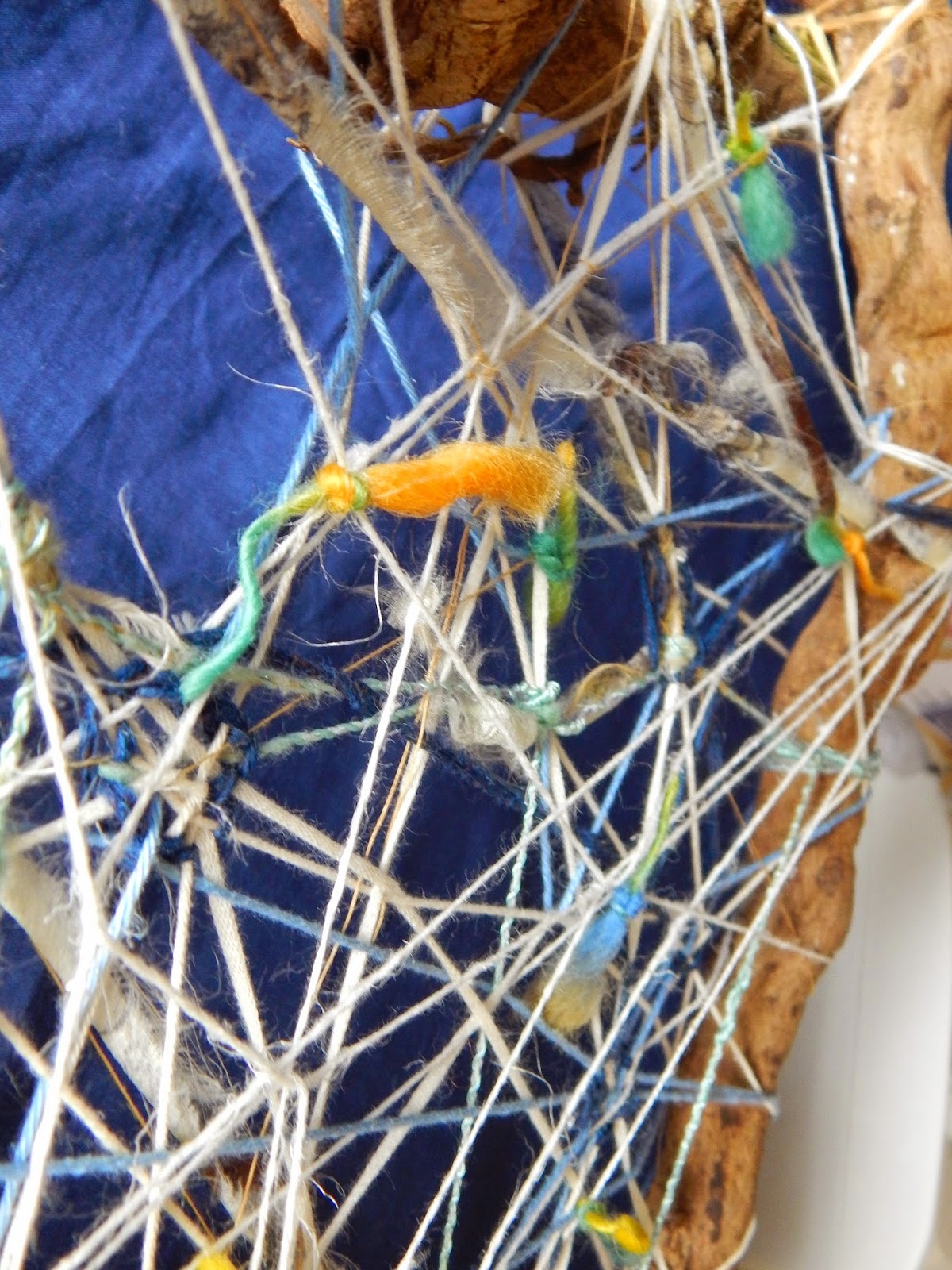
So, the first grid we are asked to work on is a free-form shaped thing. I made a 'triangle' of lumpy roots and chose a range of yarns that came through from a single order I made from Texere yarns - linens (white and gold), greeny viscose and wool (a multi-coloured slub-yarn). The sides of the frame were quite thick and the yarn fine, so there was a sense of three-dimensionality to the whole thing, and transparency of course as I let the yarns stand alone in some places and woven them in and out in others to create a very open structure. The colour tones were quite soft and pastelly, enhanced by the white, and I prefer natural fibres as this aids with the synthesis of the materials - of course viscose is a man-made fibre based on cellulose, but it has a sheen that is a useful contrast to the hairy linen for example.


I put it somewhere where I could walk past it regularly and have come to realise that what I had made first was probably a good start, but not a finished thing. It is a bit too open. Anyway, the book asks us to consider the yarn used, how it relates to the frame and what happens when it crosses and weaves within the work and relates to other yarns. I first applied a number of yarns letting them cross over and under others, but thought there was a limit to what that could be achieved and so added knots of coloured slub yarn to create some 'punctuations' on the surface on one side. I have now decided that the thing is not finished and will be adding areas of 'mass' as the current effect is a bit 'net' like and I think there needs to be patches of 'fabric' as well. The other thing to say is that the overall shape suggests a shield, which would be more enhanced with more solid shapes.

So I wove in islands of a blue wool and cotton blended yarn mix and pulled together some of the looser yarns. In fact over time the yarns has become loose, probably from the movement of the frame. At one point when I looked at it quickly it (unintentionally) almost suggested an Asger Jorn type of image - he was part of the Cobra group of artists in the 1950s and 1960s.


The next grid is a more clearly defined geometrical structure with obvious horizontals and verticals. I made it of tied-together bamboo kebab-skewers so that there would distinct sections that can be worked on individually as well as working with the frame overall. Here it is in progress with the ties yet to be trimmed back and I am working out whether I want to weave in separate rigid parts as well:


I have quite a large collection of yarns, as I am always on the look-out for interesting materials for textile work. For this module I made a small purchase of some thicker linens and cottons as well.
I am a spinner and so have a few wool tops and other fibres for spinning, including alpaca and some synthetics. For the stage here I will concentrate on what you can see on the photos:
From left: a ball of cotton postal string, cones of linen and cotton ribbon, rolls of cotton (for warp) and natural linen, sisal, hand-spun natural wools, and to the front a skein of nettle yarn. This collection is of natural fibres both plant based (linen, sisal and nettle) - cellulose based - and animal protein fibre (wool). The ones shown are in neutrals, but they can be dyed, and I am planning to dye some of the linens in dark blue and black for use later in the assignment.
Some of these fibres are coarse and hard to touch, they will produce quite rigid structures and so could be used to build large-scale pieces. During the 1960s and -70s artists such as Francoise Grossen used rope and string in knotted sculptural works. Eva Hesse covered her ropes in latex and polyester resin. More recently Ruth Lee has used nettle yarn and other more rigid fibres in jewellery design.
Here you see various hand-spun and commercial wools and silks. I did not necessarily spin all of these, you can see the spinning is quite even and balanced; I spin quite loosely depending on the project and I rarely get the balance right in the ply (balancing the yarn has to do with how much or how little the yarn is over-plied, i.e. whether the tension in the single ply has been evened out by the plying process when the wheel turns the opposite way to the original spinning). The yarns here are of differing qualities: commercial crewel wool at the front, cotton chenille (right), some old rope found on a beach (far left). There is also some spun sari silk or banana fibre (purple, in the middle right).
Silk is quite soft and has a very high lustre. It dyes like wool. In the past it was seen as a precious fibre, but it seem now to be quite ubiquitous although still holds an aura of luxury. I find it a bit flat and flacid sometimes, if not mixed with other fibres for use in garments for example. The nature of the silk depends on it origin, the species of silk worm and the way it is spun and woven.
Wool is a great fibre - it varies hugely in quality depending on the breed of sheep - from the very coarse wool of the herdwick sheep to the much finer merino. Some wools have a lustre to it which is enhanced by spinning it as a smooth yarn along the length of the fibre (almost as a worsted) - (Wensleydale wool is an example of a high-lustre wool I am particularly partial to). Cashmere and mohair are cut from goats. All these fibres dye well with acid dyes and natural dyes. Throughout history people have bred sheep to carry different types of wool for varying uses. An ancient Nordic breed such as spelsau has both a long hairy guard hair and a much softer inner wool - the guard hair may have been used for ropes and sails for ships whilst the softer inner wool would have been good for clothing and perhaps felted items.
More natural fibres, lambswool (in the large cone), silks, wool rovings for spinning or felting and the green to the left is synthetic, probably with viscose (a cellulose material).
This pile of spun and plied thicker yarns I made experimentally using wool, rayon and some feathers in different colours.
Close-up of a yarn plied with wools and a heavy linen.
Close-up of yarns (3-ply) using wools and rayon.
The close-up of yarn with feathers
A short note on synthetics: there are certain synthetic fibres that I am not too keen on - acrylic being one - it is fine for knitting when mixed with wool, but I am not sure about its quality for experimental pieces. I have seen installations using acrylic yarn, but it feels very ephemeral and has a sense of the 'plastic' about it that is less inspiring than natural fibres. Polyester is similar but from my samples in other assignments you will see that as cloth polyester has some admirable qualities that can help make interesting work.
Stage 2 Experimenting with structures
Exercise 1
This section is getting us closer to weaving within grids of various types, freeform and more fixed grids. To warm us up we are asked to weave papers and I made some to look at colour, texture of the papers and how the grid can be shaped internal to the structure.
This picture shows a large piece made of painted watercolour paper and a smaller one in a mixture of matt painted paper with a glossy section woven in. The larger piece was difficult to weave as the paper was quite weak, and I actually got a bit impatient with it and fretted about whether it would break, so I left the middle section unwoven, but anchored it down with a second section of weave. This means that under the unwoven slitted section the painted paper underneath can be seen, this is a useful effect - in fact slits are used in tapestry weaving in some cases to create relief and shading. The smaller piece shows what happens when the grid is made uneven, I cut the various section to different widths and waviness. Colour contrasts bring out the reds in the painted paper quite strongly.
When the pieces are laid out in landscape they change. I prefer the landscape format here in the smaller piece, somehow it enhances the verticality of each smaller pink sections within the grid. In tapestry weaving there is often a choice to made about whether a tapestry should be woven lengthwise or vertically as the weft threads and the way these are woven means lines are more clearly defined when woven on the horizontal - in paper weaving this is less obvious, and I have to say I found the technique to be very different from tapestry weaving; I think we are here being asked to look at what woven structures can do overall rather than thinking about the weft thread as a line to be woven in with other lines to make mass. In paper weaving the mass is integral to the whole anyway.
I also wove another matt/glossy sample where the slits were cut straight only, but in various widths. I chose green tones to evoke the Richter painting I had looked at for the colour exercise:
Exercise 2
At this point I want to comment on the structure of the projects as they are described in the book. After the paper weaving exercises the book asks us to make some braids and ropes (although rope making is visually described in exc. 3). I find that an odd position, I would have thought that this would sit more naturally after the yarn analyses to show how different yarns work in ropes etc. as combinations of 'thread as line', and then 'progress' to woven structures. I guess the book describes the braids etc. as a 'woven structure' - and I will add macramé knots to this to add a bit of variation from the flattish plaits. Anyway, l will add the braids here as expected from the book, but see grids and woven structures as a bit more distinct, almost as a prelude to tapestry proper.For this exercise I referred to a book I got recently which is one of those popularising books on fibre art that came out in the wake of the big fiberart movement exhibitions in the 1960s, Beyond Weaving (Chamberlain and Crockett (1974)). It shows work by Ruth Asawa, Francoise Grossen and Claire Zeisler amongst others, and contains a range of techniques, mainly non-woven, such as knotting/macramé, sprang, card weaving, braiding and wool/fibre preparation. I have a few of these books, but this one is pretty good at describing knotting. These are samples I made:
From left - I used sisal, course raw linen, dyed slub yarn on linen, knitting cotton and white hairy linen, and lastly a mixture of various fibres.
The techniques tested here are, from the top: slentre braid using slub wool and cotton - I liked this technique, there was a clear rhythm to it and it produced a nice thick dense braid, the middle test includes a could of techniques: half hitches and square knots, and below I used square knot in sisal. This last process I worked on in the late 1970s when I was a child. My parents had until recently a long sisal knotted 'rope' hanging outside the back door which over the years was adorned with all manner of found things from the beech including fishing hooks. I think there is good potential for using knotting; when I was working on the half hitch sample it occurred to me that you could work up large three dimensional bowl shapes for example. An artist who uses half hitches in her tapestry work is Anne Jackson.
I am not quite sure how she gets the knots to change colour and lie in the way they do, but I heard a talk by her some years ago and she showed a slide of work in progress where each knot had its own strand of yarn, and she worked from the top down, as in knotting, without a loom. Using knots she can freely shape the edge, it is not tied to the grid in the way a loom-based work might be. Still her work is considered alongside other tapestry artists' work, and her finished pieces are in effect wall hangings.
The samples include, from the left: Four stranded braid, a flat woven braid and a six-stranded round braid. The two braids on the sides were made with various qualities of yarn - some heavier than others. You can see on the right that the blue wool (rug yarn) seems to be encircled by the other yarns which are harder (cotton string and linen). This is probably happening because the proportion of hard to soft is dominated by the harder and they seem to be 'doing their own thing' in relation to the wool.
Braiding is an ancient technique and is mastered by many cultures, including my own Scandinavian. An element of the Egtved girl 's skirt was a card woven band (Nordic bronze age), and braids are used for all manner of decoration on furnishings and garments in different cultures.
Exercise 3
So, the first grid we are asked to work on is a free-form shaped thing. I made a 'triangle' of lumpy roots and chose a range of yarns that came through from a single order I made from Texere yarns - linens (white and gold), greeny viscose and wool (a multi-coloured slub-yarn). The sides of the frame were quite thick and the yarn fine, so there was a sense of three-dimensionality to the whole thing, and transparency of course as I let the yarns stand alone in some places and woven them in and out in others to create a very open structure. The colour tones were quite soft and pastelly, enhanced by the white, and I prefer natural fibres as this aids with the synthesis of the materials - of course viscose is a man-made fibre based on cellulose, but it has a sheen that is a useful contrast to the hairy linen for example.
I put it somewhere where I could walk past it regularly and have come to realise that what I had made first was probably a good start, but not a finished thing. It is a bit too open. Anyway, the book asks us to consider the yarn used, how it relates to the frame and what happens when it crosses and weaves within the work and relates to other yarns. I first applied a number of yarns letting them cross over and under others, but thought there was a limit to what that could be achieved and so added knots of coloured slub yarn to create some 'punctuations' on the surface on one side. I have now decided that the thing is not finished and will be adding areas of 'mass' as the current effect is a bit 'net' like and I think there needs to be patches of 'fabric' as well. The other thing to say is that the overall shape suggests a shield, which would be more enhanced with more solid shapes.
So I wove in islands of a blue wool and cotton blended yarn mix and pulled together some of the looser yarns. In fact over time the yarns has become loose, probably from the movement of the frame. At one point when I looked at it quickly it (unintentionally) almost suggested an Asger Jorn type of image - he was part of the Cobra group of artists in the 1950s and 1960s.
The finished thing
The next grid is a more clearly defined geometrical structure with obvious horizontals and verticals. I made it of tied-together bamboo kebab-skewers so that there would distinct sections that can be worked on individually as well as working with the frame overall. Here it is in progress with the ties yet to be trimmed back and I am working out whether I want to weave in separate rigid parts as well:
With weave in progress

What is noticeable is that the frame has distorted. I started off setting up mini-warps in one section of the grid and then wove a bit in those, until I looked at the rest of the grid and decided that actually that was not what was expected of the sample, and also weaving on grid-like warps was too close to the tapestry weave in project 9. So I used all manner of yarns to string across the grid, and it looks effective to have the 'traditional' warp over-crossed by diagonals which again have been woven over and caught up into each other. This sample is starting to work quite well - again it looks very much like those 1970s-80s needle woven works. I have used the coloured wools that suggest the green Richter painting but decided to bring out the contrast by using pinks and some golden mustards.
Subscribe to:
Posts (Atom)