Showing posts with label project 8. Show all posts

Wednesday, 19 August 2015

Feedback - Assignment 4 - with my reflections

My first comment - on assignment 4

For this feedback review I will comment in a different colour throughout my tutor's text. This is to respond to the specific points. On the whole she has provided positive feedback, so I am satisfied, but occasionally I have been surprised at some omissions, and I will mention these here and there.


[Tutor's] Overall Comments

Lorna in general this is competent body of work where you have developed your abilities and understanding of textiles.  All the samples you have sent me have been made with care and attention to detail.  There is a pleasing use of colour and texture in your weave pieces.  The work could be better organised with more labeling that includes your name student number and which assignment the work belongs to.  This will help enormously at assessment.  Your learning log is organised, it includes both your work and any research you have done.
 
LG: this is quite good commentary and I am happy with this; the note about the lack of labelling does not worry me, I will be labelling up everything for the assessment.

Assessment potential


I understand your aim is to go for the Textiles Degree and that you plan to submit your work for assessment at the end of this course. From the work you have shown in this assignment, providing you commit yourself to the course, I believe you have the potential to succeed at assessment.  In order to meet all the assessment criteria, there are certain areas you will need to focus on, which I will outline in my feedback.   

This is a standard comment that seems to be included in all feedback

Feedback on assignment

Demonstration of technical and Visual Skills, Quality of Outcome, Demonstration of Creativity

I think from your learning log you have not sent me all the work from assignment 4.  I suggest that you are clear with your tutor about what you have sent and what you may have left out.  This helps in making informed judgments and giving the appropriate feedback.

[LG: not sure why says this here - I had sent her an email prior to submission saying I would not be sending two items that did not fit in the box with the rest of the work, and she had said that was OK in a reply email.]

The sample work you have sent has been made to a high standard of craftsmanship.  There is consideration to colour and texture.  You have used some interesting materials in some of the weaves including the one with the central blue square.   There is evidence that you are skilled and conscious of the quality of your outcomes.  What I suggest you need to work on is your creativity.  Your blurry photographs are really interesting.  They are energetic in limited but pleasing colour palettes.  Here I feel I am getting a taste of something that stimulates and excites you that is quite individual.  But I feel you are struggling to express this in your drawings and textile work.  To be honest this is the tricky bit but it is also when you get it right the part that will get you a good degree. 
 
LG: This good feedback, I am glad she thinks my work has some technical quality, I try to work with quality in mind (up to a point though, especially in machine embroidery) - but then I have woven for a bit. I have enjoyed doing the photography and I agree that they could be worked up, what is not said here is that I printed out some of these pictures, and I am planning to work up these more in my workbook on trees (she would not have been able to see these plans, they are still in my head).

She is also partially right about the creativity element, I occasionally think about interpretation of design, it is not easy, and I will work on this more for assignment 5. However, I am also a bit concerned about what she means with 'creativity'. As she has not mentioned my colour matching elements, and as the course handbook allowed for free design on the loom I am surprised that the texture samples are not referenced here, although she does go on to mention the green sample and its links to the leaf photographs:

You are some way there, for example in your sketchbook there is a loose drawing of a photograph of what looks like peeling paint.  You have used a mixture of media to express the hard lines of the cracked paint and the soft rust colours.  This sort of drawing functions really well as inspiration for textile work.  I suggest you explore the blurry photos in the same way.  Using different media and ways of adding them to the paper to create what you see.  When I say different ways of adding the media to the paper I mean how you use the tool (pencil, paint brush, finger).  This could be by pressing down hard or lightly, moving quickly or slowly, filling your brush with paint or keeping it dry.  Repeat drawings of the same image but in different mediums or style – this will help to develop your skill but also find the best way of drawing a particular image.  For more information about your drawing please refer to the feedback on Foundations in Textiles: Sketchbook assignment.

LG: yes, I agree with all of this, that will be my next steps for assignment 5, as well as more photography now we are entering a darker, autumnal season

You are also some way there with the green weave; it has the abstract feel of the blurry photographs.  There is movement, texture and highlights of colour that balance nicely in the space.  I suggest you continue to explore the visual world through photography, drawing and sample making.  Starting with the photo that you explore through drawing and mark making which leads to textile sampling.  Documenting the journey in your learning log.
 
LG: so, overall I am satisfied that I can build on my learning from assignment 4.
Again surprisingly, she has not mentioned any of the colour work and samples in project 8. Not that I mind, this was preparatory work for the wider project 9 work. Neither has she mentioned anything about courses I have undertaken, I am not sure what to make of this.

It would be good if there could be some sort of debate about what 'creativity' means. I believe that the making process itself is creative, I think what the tutor is trying to get at here is the actual designing and 'artistic' process which of course I am still a novice at.

Learning Logs or Blogs/Critical essays/Research Material

Context, reflective thinking, critical thinking, analysis  

Your learning log is easy to navigate and articulate.  However I suggest you include less surplus information.  For example

We had a day out in Chichester recently. I had been promoting this to my husband for some time now, as soon I will be travelling to near there quite a bit, so before the journey becomes commonplace, I thought it would be good to do it for pleasure. And there are antique shops there, which we both like visiting...”

Concentrate on the artwork you saw and what you thought of it.  For example why were the St Ives paintings dull?  Was it the colour, texture, form, etc.?  You ought to be analysing the work so that you can learn something from it.   When looking at an artwork spend some time looking at it – several minutes.  Think about what you see, the materials used, the composition and how the artist has achieved their outcome. 

I didn’t realize there was a Marc Chagall stain glass window in Chichester.  What was it like?  Did it still have the dream like qualities of his paintings?  Did his strong use of colour work well in the window?  Was there anything you learnt from the window that you could bring to your own creativity?
 
LG: Hmm, I have to admit that I was quite tired after the Chichester visit, so did not want to spend much time writing in detail about the visit. In the blog I had separately included an object analysis of a brooch and a short analysis of woven obi, but these have not attracted any commentary. They were ways for me to practice short object analysis, but were not expected by the course book - I wonder whether the learning log should only be about the required learning material, or how far one can move beyond it?

Your reflections of your own work when prompted by the questions in the course material are thorough and enlightening.  You could do with examining your work more closely in the other areas of your learning log.  Start with description – materials, techniques, composition and then (this is the important bit) go on to discuss how well these elements work together.  Are there some parts of a sample or a drawing that are stronger than others?  What would you change or develop?  I also suggest you write in your learning log more regularly, very time you have worked on something even if it isn’t finished or you are not that happy with.  

Assignment 5 work on trees is a nice big topic to choose.  I suggest you use the feedback from this and the sketchbook assignment to improve your drawing and the creativity in your sample making.  Try not to be in a rush to make the final piece.  At assessment we will be looking at how you use your research, drawing and sample making to come up with an idea for the final textile sample.

LG: OK - the note about writing more commentary has been made before. Writing the learning log takes a long time, and writing more reflective thoughts is going to be more time consuming, when I am also going to be drawing more. I work full time, I am frequently tired when I get home from work, soon I will be doing some voluntary work which will be a stretch, so I reserve judgement on whether I can manage this additional work. This is about balancing my energy resource with time and demand of the course (goodness me how that sounded like something I sometimes say at work!).

Suggested reading/viewing

Context

I recommend Steal Like an Artist by Austin Kleon.  This small book is packed with easily digestible information about how to do research and act upon it. 

Drawn to Stitch: line, drawing and mark making in textile art by Gwen Hedley and Mark-making in Textile Art by Helen Parrott.  These are both excellent publications with tips and inspiration on how to use drawing in your textiles. 

 Pointers for the next assignment

  • Include a contents list and labeling
  • Invest some time in improving your drawing skills
  • Use your drawings to come up with textiles sample ideas
  • Analyse the work of others
  • Reflect on your drawings and samples
  • Reflect on this feedback form in your learning log
Well done, Lorna I look forward to your next assignment.

LG final comment
So, a reasonable feedback and good advice for next steps, thank you to my tutor for these comments.

The recommended reading is fair, I have the Hedley and Kleon books already, so will re-visit these, and look at the Parrott. I will try to get in more observational drawing, continue to look at art and design through visits, do courses and continue to write about it on the blog. How much more writing I can do is a question to be addressed when I get to it, maybe it is more about saying the right things at key points, rather than to just add more narrative with little meaning.

Sunday, 5 April 2015

Tex 1 Assignment 4 Project 8 - reflections on constructed samples

This project ends with some questions on  the process and materials of the project:

Did you enjoy inventing constructed surfaces? Were you surprised at the results? Can you see a connection between your choice of materials and the types of structures you made – regular, irregular, small or large scale? Which samples worked best – and why?

These exercises were kind of interesting and challenging at the same time. I knit a lot, following patterns, and so do not usually ‘invent’ structures of my own, unless I do a bit of tapestry weaving or look a bit creatively at knit. That means that this use of yarn to freely assemble something into a synthesis to become a finished object can be difficult to think through. But I am fairly happy with the samples. I have also been studying the work of sculptural fibre artists and see that Ed Rossbach’s basket woven work is described as ‘improvisational’. Maybe that is what this work is all about – and I was working along on my woven/wrapped grid, looking at it occasionally when I saw a photograph of a Rossbach basket in a catalogue I have on mid-century American crafts (Museum of Arts and Design (2011)) where he seems to have been weaving open sections developed from any direction the ‘warp’ willows might fall in his construction, and there were quite a few coincidences in the way my own work was developing.

During the making of the samples (and especially these constructed ones) the work grows on you, and by looking at them over a longish period you start to see patterns and dimensions which can be built on. And yes, materials are crucial in this – whether they are shiny or matt, solid and dense, heavy or light. I have been looking at Eve Hesse’s work recently and am in two minds about it, however what is clear is that her focus seems to have been on process and materials and that she thought quite hard about the relationships between them. The fibre artists working around that time (1960s) also seem to have been focusing on structure and how this inter-related with materials, often on a very large scale.

So in a very small way I have quite enjoyed these exercises and got unusual results out of it. My husband joked that my ‘shield’ sample was a lacrosse racket, and that is the type of response you might expect from an untraditional piece, there is a search for something familiar in the unfamiliar; but I think the robust edges of that piece in contrast to the finer threads and small areas of woven patches worked quite well in the end.

The other grid piece is developing well. It is difficult to decide at what angle it will eventually look its best. It is being woven from various sides, and you get used to looking at it from one side more than another during making. As I mentioned in a different area, I enjoy natural materials, they have a great feel in the hand, I understand more about how they respond to processes (weaving, knotting, hanging, draping and so on), and they work well with wooden frames, and independent free-standing-hanging pieces such as the low relief samples in this project.

Hard materials such as thicker linens and sisal can be used in bigger pieces. There is much potential in these materials and they can be wrapped or hung with finer more shiny materials to create interest. If there is one think I find difficult in working in this sort of free and spontaneously constructive way it is getting a feel for when something is finished. I mean really finished, not almost, or overly finished and I am not sure when that point of balance comes. I prefer to work on something until I tire of it.  With that statement I don’t mean getting bored with it, but more working on it until there is a sense of exhausting a certain stage and then putting it somewhere where it can be looked at over time until a new dimension becomes obvious and needs to be fulfilled.

How accurate were you in matching all the colours in your postcard: with paints?

I liked the colour matching exercise. Richter’s paintings are complex and have many, many different colours in them in different proportions, but I had a go, and found my final analyses useful. I used gouache and other water based media. Some of these mixes came out well, and overall I think gouache was probably the better media.

with yarns/other material?

In any case there were strong colour themes in both pictures, green in one, blue in the other. I have quite a large yarn collection so could identify some good likenesses to the colours in the pictures. The charity shop is always a good source for embroidery yarns and crewel wools, and these wools come in all manner of colours, and I have collected a fair few bundles for weaving. What is equally important I guess is the quality of the yarn, alongside the colour, as a shiny, smooth yarn casts light differently from a matt one. This is important in textile design where the characteristics of the materials is one of the key factors I how the work will look depending on the techniques of making.

Sunday, 22 March 2015

Assignment 4 - starting the Textile Structures section - colour analysis

This assignment seems to me to be about the construction of textiles. It covers braid and rope making, plaiting and weaving. I had hoped there was something in there about knotting and  other free-form 3D work, but I may, if I have time, play around with that as well during this assignment anyway. There is a written research point about textile art, what it is and what it means in the context I assume of Western art.

Reading through the workbook there is something in there about the grid, working freely within the grid, but probably not overtly anything about working outside the grid, 'off the wall' as some writers describe it. The weaving is based on tapestry weaving, which is great, I enjoy working in that medium, and it does allow for all manner of experimentation with fibre, structure, qualities of threads, yarn and string, and colour.

I have chosen a workbook with black pages for this assignment. Black is very useful for framing work and it changes the way colour works when either painted directly onto it or mounted on to enable the black background to frame it - white makes things luminous while black makes things poised and sombre.

The workbook starts off with some colour exercises, to create examinations of works and analysing them in terms of proportion. I chose a couple of paintings by Gerhardt Richter, Cage (1) (2006) and Wald (3) (1990) both were shown at the Tate Modern exhibition in 2012.  I will link to the paintings found on the Gerhardt Richter web-site, and you can find the images there quite well defined. So, these paintings are in fact not so easy to analyse, and colour choices derived from them needed to be simplified. I had several goes trying to identify and mix paints, gouache, watercolour and water soluble crayons, to work out what would be useful to find the colours for the next steps. In the paintings Richter has applied the colours quite thickly and then pulled them across the canvas which has led to the colours mixing and giving both paintings a horizontal effect in the smearing of the colours. Sometimes it is possible to discern a distorted representation underneath this pulled paint, but I have tried and failed to see it in these two cases. Anyway, I like Gerhardt Richter's work, I find it well-thought-out, carefully considered and he uses beautiful colours in interesting ways.

Here are some examples of what I did to analyse Cage (1). The main colours in this painting are greens, some blue-green with darker shades and browns.

The first picture shows testing the colour medium and water colour paper I went on to use (it is quite grainy and was good for applying water-based media, but less good when trying to add more wet on wet, it started to disintegrate after a while):


This second picture shows a section of a collage I made. The painted page is more of a lay-out exercise working out where the colours sit in the painting. I also made a couple of yarn wraps to think about the colour distribution and how these would work out in textiles.


Wald (3) / Forest (3) (1990) contains a lot of blue, but there are many other colours in there - green (as a mix with the blue, so more of a blue-green), yellows, oranges, browns, a strange coral red (that I do not really have much of in yarn) and pinks, white as well as, what looks like greys.
 
Again I had a go at mixing colours and working out how it would work using gouache in various levels of viscosity, and then another collage to work on colour proportion and effects of how colours work together. I had to paint a bit of diluted black over it to make it darker in sections.

 
More testing paint and a section of testing paint on the black paper directly. The colours are dulled and the orange looks more mustard:

 
And here an analysis of how the colours lie on the painting as an attempt at working out proportions - luckily I found a bag of wools that contained that coral I didn't have:

 
Between the analyses of the Richter paintings I also gathered a collage of browns and earthy tones. I did a wool wrap of that as well:


Tex 1 ass 4 - Project 8 yarns and structure

Stage 1 Exploring the qualities of yarns

I have quite a large collection of yarns, as I am always on the look-out for interesting materials for textile work. For this module I made a small purchase of some thicker linens and cottons as well.

I am a spinner and so have a few wool tops and other fibres for spinning, including alpaca and some synthetics. For the stage here I will concentrate on what you can see on the photos:

 
From left: a ball of cotton postal string, cones of linen and cotton ribbon, rolls of cotton (for warp) and natural linen, sisal, hand-spun natural wools, and to the front a skein of nettle yarn. This collection is of natural fibres both plant based (linen, sisal and nettle) - cellulose based - and animal protein fibre (wool). The ones shown are in neutrals, but they can be dyed, and I am planning to dye some of the linens in dark blue and black for use later in the assignment.
 
Some of these fibres are coarse and hard to touch, they will produce quite rigid structures and so could be used to build large-scale pieces. During the 1960s and -70s artists such as Francoise Grossen used rope and string in knotted sculptural works.  Eva Hesse covered her ropes in latex and polyester resin. More recently Ruth Lee has used nettle yarn and other more rigid fibres in jewellery design.
  
 
Here you see various hand-spun and commercial wools and silks. I did not necessarily spin all of these, you can see the spinning is quite even and balanced; I spin quite loosely depending on the project and I rarely get the balance right in the ply (balancing the yarn has to do with how much or how little the yarn is over-plied, i.e. whether the tension in the single ply has been evened out by the plying process when the wheel turns the opposite way to the original spinning). The yarns here are of differing qualities: commercial crewel wool at the front, cotton chenille (right), some old rope found on a beach (far left). There is also some spun sari silk or banana fibre (purple, in the middle right).
 
Silk is quite soft and has a very high lustre. It dyes like wool. In the past it was seen as a precious fibre, but it seem now to be quite ubiquitous although still holds an aura of luxury. I find it a bit flat and flacid sometimes, if not mixed with other fibres  for use in garments for example. The nature of the silk depends on it origin, the species of silk worm and the way it is spun and woven.
 
Wool is a great fibre - it varies hugely in quality depending on the breed of sheep - from the very coarse wool of the herdwick sheep to the much finer merino. Some wools have a lustre to it which is enhanced by spinning it as a smooth yarn along the length of the fibre (almost as a worsted) - (Wensleydale wool is an example of a high-lustre wool I am particularly partial to). Cashmere and mohair are cut from goats. All these fibres dye well with acid dyes and natural dyes. Throughout history people have bred sheep to carry different types of wool for varying uses. An ancient Nordic breed such as spelsau has both a long hairy guard hair and a much softer inner wool - the guard hair may have been used for ropes and sails for ships whilst the softer inner wool would have been good for clothing and perhaps felted items.

 
More natural fibres, lambswool (in the large cone), silks, wool rovings for spinning or felting and the green to the left is synthetic, probably with viscose (a cellulose material).

 
This pile of spun and plied thicker yarns I made experimentally using wool, rayon and some feathers in different colours.
 
 
Close-up of a yarn plied with wools and a heavy linen.


Close-up of yarns (3-ply) using wools and rayon.

 
The close-up of yarn with feathers

A short note on synthetics: there are certain synthetic fibres that I am not too keen on - acrylic being one - it is fine for knitting when mixed with wool, but I am not sure about its quality for experimental pieces. I have seen installations using acrylic yarn, but it feels very ephemeral and has a sense of the 'plastic' about it that is less inspiring than natural fibres. Polyester is similar but from my samples in other assignments you will see that as cloth polyester has some admirable qualities that can help make interesting work.


Stage 2 Experimenting with structures

Exercise 1

This section is getting us closer to weaving within grids of various types, freeform and more fixed grids. To warm us up we are asked to weave papers and I made some to look at colour, texture of the papers and how the grid can be shaped internal to the structure.

 
This picture shows a large piece made of painted watercolour paper and a smaller one in a mixture of matt painted paper with a glossy section woven in. The larger piece was difficult to weave as the paper was quite weak, and I actually got a bit impatient with it and fretted about whether it would break, so I left the middle section unwoven, but anchored it down with a second section of weave. This means that under the unwoven slitted section the painted paper underneath can be seen, this is a useful effect - in fact slits are used in tapestry weaving in some cases to create relief and shading. The smaller piece shows what happens when the grid is made uneven, I cut the various section to different widths and waviness. Colour contrasts bring out the reds in the painted paper quite strongly.
 
When the pieces are laid out in landscape they change. I prefer the landscape format here in the smaller piece, somehow it enhances the verticality of each smaller pink sections within the grid. In tapestry weaving there is often a choice to made about whether a tapestry should be woven lengthwise or vertically as the weft threads and the way these are woven means lines are more clearly defined when woven on the horizontal - in paper weaving this is less obvious, and I have to say I found the technique to be very different from tapestry weaving; I think we are here being asked to look at what woven structures can do overall rather than thinking about the weft thread as a line to be woven in with other lines to make mass. In paper weaving the mass is integral to the whole anyway.
 
 I also wove another matt/glossy sample where the slits were cut straight only, but in various widths. I chose green tones to evoke the Richter painting I had looked at for the colour exercise:
 
 
Exercise 2
 

At this point I want to comment on the structure of the projects as they are described in the book. After the paper weaving exercises the book asks us to make some braids and ropes (although rope making is visually described in exc. 3). I find that an odd position, I would have thought that this would sit more naturally after the yarn analyses to show how different yarns work in ropes etc. as  combinations of 'thread as line', and then 'progress' to woven structures. I guess the book describes the braids etc. as a 'woven structure' - and I will add macramé knots to this to add a bit of variation from the flattish plaits. Anyway, l will add the braids here as expected from the book, but see grids and woven structures as a bit more distinct, almost as a prelude to tapestry proper.

For this exercise I referred to a book I got recently which is one of those popularising books on fibre art that came out in the wake of the big fiberart movement exhibitions in the 1960s, Beyond Weaving (Chamberlain and Crockett (1974)). It shows work by Ruth Asawa, Francoise Grossen and Claire Zeisler amongst others, and contains a range of techniques, mainly non-woven, such as knotting/macramé, sprang, card weaving, braiding and wool/fibre preparation. I have a few of these books, but this one is pretty good at describing knotting. These are samples I made:


From left - I used sisal, course raw linen, dyed slub yarn on linen, knitting cotton and white hairy linen, and lastly a mixture of various fibres.

 
The techniques tested here are, from the top: slentre braid using slub wool and cotton - I liked this technique, there was a clear rhythm to it and it produced a nice thick dense braid, the middle test includes a could of techniques: half hitches and square knots, and below I used square knot in sisal. This last process I worked on in the late 1970s when I was a child. My parents had until recently a long sisal knotted 'rope' hanging outside the back door which over the years was adorned with all manner of found things from the beech including fishing hooks. I think there is good potential for using knotting; when I was working on the half hitch sample it occurred to me that you could work up large three dimensional bowl shapes for example. An artist who uses half hitches in her tapestry work is Anne Jackson
 
I am not quite sure how she gets the knots to change colour and lie in the way they do, but I heard a talk by her some years ago and she showed a slide of work in progress where each knot had its own strand of yarn, and she worked from the top down, as in knotting, without a loom. Using knots she can freely shape the edge, it is not tied to the grid in the way a loom-based work might be. Still her work is considered alongside other tapestry artists' work, and her finished pieces are in effect wall hangings.
 
 
The samples include, from the left: Four stranded braid, a flat woven braid and a six-stranded round braid. The two braids on the sides were made with various qualities of yarn - some heavier than others. You can see on the right that the blue wool (rug yarn) seems to be encircled by the other yarns which are harder (cotton string and linen). This is probably happening because the proportion of hard to soft is dominated by the harder and they seem to be 'doing their own thing' in relation to the wool.
 
Braiding is an ancient technique and is mastered by many cultures, including my own Scandinavian. An element of the Egtved girl 's skirt was a card woven band (Nordic bronze age), and braids are used for all manner of decoration on furnishings and garments in different cultures.

Exercise 3

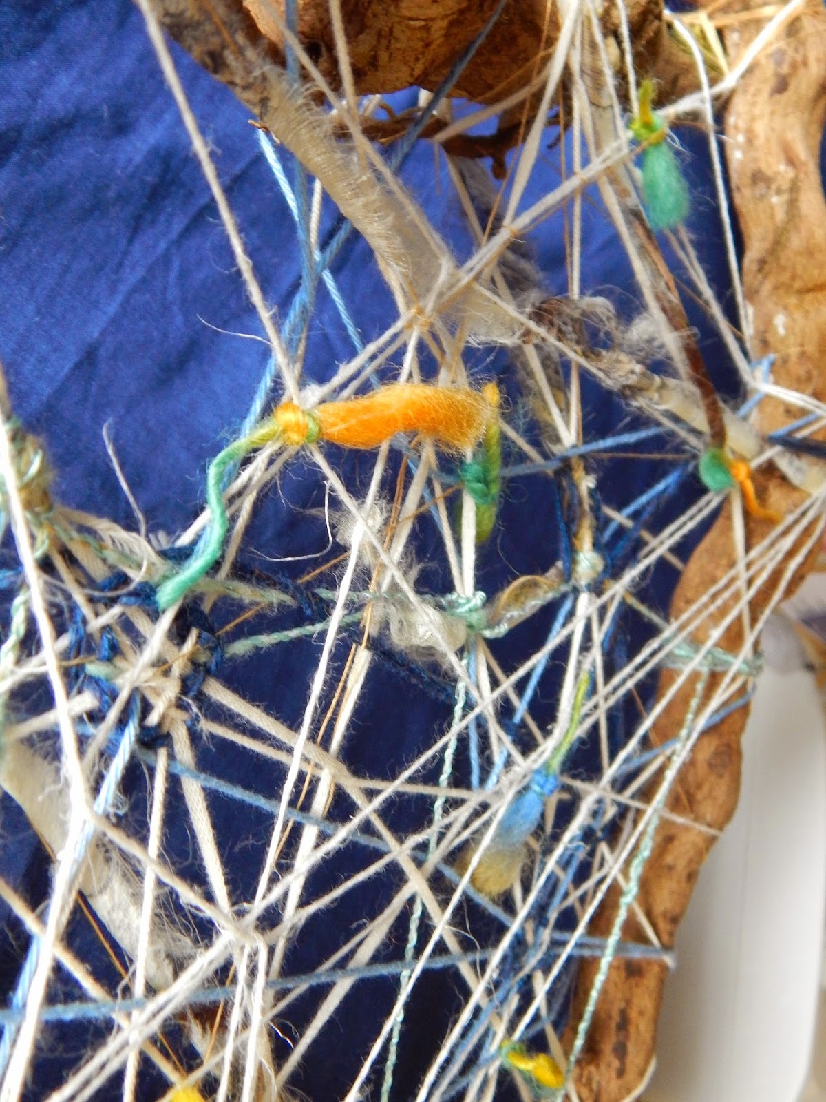
So, the first grid we are asked to work on is a free-form shaped thing. I made a 'triangle' of lumpy roots and chose a range of yarns that came through from a single order I made from Texere yarns - linens (white and gold), greeny viscose and wool (a multi-coloured slub-yarn). The sides of the frame were quite thick and the yarn fine, so there was a sense of three-dimensionality to the whole thing, and transparency of course as I let the yarns stand alone in some places and woven them in and out in others to create a very open structure. The colour tones were quite soft and pastelly, enhanced by the white, and I prefer natural fibres as this aids with the synthesis of the materials - of course viscose is a man-made fibre based on cellulose, but it has a sheen that is a useful contrast to the hairy linen for example.


I put it somewhere where I could walk past it regularly and have come to realise that what I had made first was probably a good start, but not a finished thing. It is a bit too open. Anyway, the book asks us to consider the yarn used, how it relates to the frame and what happens when it crosses and weaves within the work and relates to other yarns. I first applied a number of yarns letting them cross over and under others, but thought there was a limit to what that could be achieved and so added knots of coloured slub yarn to create some 'punctuations' on the surface on one side. I have now decided that the thing is not finished and will be adding areas of 'mass' as the current effect is a bit 'net' like and I think there needs to be patches of 'fabric' as well. The other thing to say is that the overall shape suggests a shield, which would be more enhanced with more solid shapes.


So I wove in islands of a blue wool and cotton blended yarn mix and pulled together some of the looser yarns. In fact over time the yarns has become loose, probably from the movement of the frame. At one point when I looked at it quickly it (unintentionally) almost suggested an Asger Jorn type of image - he was part of the Cobra group of artists in the 1950s and 1960s.


The finished thing

The next grid is a more clearly defined geometrical structure with obvious horizontals and verticals. I made it of tied-together bamboo kebab-skewers so that there would distinct sections that can be worked on individually as well as working with the frame overall. Here it is in progress with the ties yet to be trimmed back and I am working out whether I want to weave in separate rigid parts as well:

 
With weave in progress
 

What is noticeable is that the frame has distorted. I started off setting up mini-warps in one section of the grid and then wove a bit in those, until I looked at the rest of the grid and decided that actually that was not what was expected of the sample, and also weaving on grid-like warps was too close to the tapestry weave in project 9. So I used all manner of yarns to string across the grid, and it looks effective to have the 'traditional' warp over-crossed by diagonals which again have been woven over and caught up into each other. This sample is starting to work quite well - again it looks very much like those 1970s-80s needle woven works. I have used the coloured wools that suggest the green Richter painting but decided to bring out the contrast by using pinks and some golden mustards.