Monday, 20 October 2014

Intervals

Well now, one may ask - why haven't I been able much textile work recently? In fact, apart from what I describe on a previous blog on visits to London, and stash building exercise buying fleece, yarn and dye recently (October), I have not actually been able to get into making for the course in the last 4 weeks.

My work has been very busy, I get home tired, and then we had a new kitchen built, which means that the house has been in upheaval when I got home. Really not conducive to then sit down and concentrate on the course.

A shame, as I have plenty of ideas, have decided to look at trees in some way for the final assignment and project 7, and so will try to look at sampling along this theme as well in my steps towards that final assignment on this course.

I did do some dyeing of wool, using autumn berries, black and elder berries. I got a variety of colours and have been knitting a waistcoat on an Alison Ellen pattern, which is coming along fine, just a small thing to get on with when you are tired, sitting watching TV and not having to think too hard. OK, I also think that knitting is a kind of short-cut, a way of making something nice and comforting in a direct way, and it fills a hole where my design work should be.

Here is a detail showing the colours:


The picture does not really do the colours justice, but the rosy pinks are the elderberry dye, the purple tones blackberry. The exhaust gave greys with a tiny bit of iron modifier (the blue is some contrasting commercial yarn which I did not dye). Quite satisfying. The waistcoat was completed in November, but I continued to find it difficult to get into things. Thankfully with the Christmas break I had a chance to catch up and have now got into making samples again.


Visits and exhibitions - October

Here in October the Knitting and Stitching show has been on at the Alexandra Palace. I have been a couple of times before, but this year I went twice - a glutton for punishment one may say, as I went on Friday (10th), and then on Saturday (11th), one of the busiest days.

Anyway, my friend and I went on the Friday for fun, to see what was new and interesting - we started by looking at the exhibition area, including the student awards. There were some fine textured knits I found quite good, and I think the International Feltmakers Association showed some very strong things. Ecoprinting, one of the latest trends in creative textiles it seems, was also shown on a commercial stand, and yes, there the usual suspects were, Jan Beaney and other creative tutors and suppliers of materials. Coats had a large stand dedicated to Rowan yarns and patterns and there were many, many smaller suppliers of all things textiley and equipment based.

What did I buy? well I had planned a visit to Oliver Twists to get some silk bricks for spinning with some mohair and Wensleydale fleece I have, and got a couple of fine green ones; I also splashed out on a pack of Markal paint sticks. To have a rest in the afternoon we decided to sit in on the fashion show. This was actually disappointing. Rowan showed garments from its latest pattern books, and so did other Coats brands such as Patons, but there was nothing really outstanding in the show. One might have thought that a fashion show would have pulled out all the best or most extravagant garments to show what can be done, stretching boundaries of technique or experiments in colour; instead there were uninspiring plain jumpers, the odd good Fairisle cardigan and a run of ponchos designed on a South American theme - presented to promote a particular stand somewhere in the sea of stall of the large hall.

On Saturday, when most tickets had been sold out and the crowds were thick in the aisles of the shopping hall, I went to volunteer in the British Tapestry Group's stand, which had an exhibition of professional and amateur pieces made by the Group's members, and curated by Hillu Liebelt. This was good, I met a Swedish weaver, Lis Korsgren, who had a piece showing. I had a chat with Lis about her construction method which is derived from Helena Hernmarck's work. The work is semi-representational but looks abstract close up. Her work in the show was a blue and white hanging showing tractor tracks in snow, using different densities of yarn in the weft I thought that was quite interesting, since it is made on a cloth weaving loom rather than a tapestry loom and stimulates questions of technique and visual representation.

I have to say I have mixed feelings now about the Knitting and Stitching show. It is a very good opportunity to see some current work, however the show is dominated by shopping and the craft consumerism of a huge textile-based shopping mall. There are of course many gems, I like that Slow Loris is there showing and selling exquisite work made by Chinese tribal people, it is good that smaller sellers are able to show their work and one can peruse this physically rather than looking at tiny photos on the web. However I know from experience, and from having spoken with a number of people who also visit these events, that what one takes away from the show in many cases ends up as stash, and bulky stuff at home in the work room rather something made, and that defeats the object of the making that the notion of craft is all about.

Anyway, the reason I say this is that I had been to see the Anselm Kiefer exhibition at the Royal Academy on the Thursday (9th) before, and it struck me on reflection, that I personally do not feel uplifted in a profound  way after a large crowded sales fair (whether textiles based or otherwise) as I do having experienced a great and immersive exhibition such as that on Anselm Kiefer. There were such fantastic paintings there, huge canvasses boldly covered in thick paints, ash, clay and material objects, including natural bits of sunflowers, branches and long strands of grass or reed. The exhibition was curated following a chronological line, his early work quite explicitly narrative somehow, recording and speaking of his early reactions to post-war German history, whilst the later works were grand statements more subtle in expression, despite their scale and monumental statements. He is clearly interested in certain poets and language, German landscape and forests, the materiality of the stuff he uses to build up his work. He uses words on the surface of pieces, sometimes words, at other times sentences.

To be honest I knew very little about Kiefer before I went. I vaguely knew he was important,  but I was very glad I went and saw so many poetic and finely telling pieces. Art historically there were references to Caspar David Friedrich, van Gogh and Joseph Beuys; there were nudes in large books and large installations of stuff - a mound of canvasses - the room smelling of oil paints, script on the wall. Clearly Kiefer has become quite wealthy in his later years, in recent years buying lead roofs off cathedrals and inserting diamonds into large textured lead surfaces - although modest seeming, maybe not as humble as one might have hoped during a time when those with less might think twice even going into a paying exhibition such as this one. But then that shows where my cultural capital lies, in placing a socio-cultural reading on this work when clearly the aesthetics seemed to be a priority (in the case of the diamonds and lead, a matter of alchemical processes). So, despite feeling that there was a flaw in this later work, I still loved the large landscapes of grasses, some with gold leaf, giant grasses swaying in the wind with golden sheaves of grass or reed pasted on to thick encrustations of paint. And carefully placed balances that seemed to weigh something heavy - time passing? Nature? the land?

In contrast to what these grand statements about nature, a sense of German-ness and art historical bonds evoked as I walked through the halls of the Royal Academy, a virgin spectator of this somehow romantic work by Kiefer, the days at the Knitting and Stitching show had vanishingly little to offer in speaking to something more than the somewhat consumerist aspects of contemporary textile crafts. Am I comparing apples and pears? well maybe, but I can't help thinking that if I want my work to sing it is by visiting the ideas of artists that inspiration will come, not so much from gathering overwhelming masses of stuff - the solitary reflection of ideas rather than the sensory overload of the crowded shopping hall...... However there is something fun about shopping that you can't completely ignore.

Sunday, 28 September 2014

A September trip to Bruges

We went to Bruges for a short holiday over the weekend from 18th September to 22nd. There was a quick stop for a few hours in Bruxelles - I went to see half of the Royal Museum of Art and History as there was not much time. I do wish I had had more time, the ethnographic collections looked very good.

This museum was extremely quiet. It seemed to be a bit in the vein of the British Museum, but there very few visitors. For someone whose knowledge of medieval arts and crafts of the low countries is pretty scant, there were some good pieces of wood work - carved altarpieces, and religious paintings on panel. Some very good carvings of figures in wood looked very impressive, and of course there were great tapestries of all types - small precious things that looked as if they were for private contemplation, with gold and silver thread that would have sparkled in the candle light of dark rooms, as well as large wall coverings. There was also some historical glass and some ceramics from the 1920s, which I did not find particularly inspiring.

Having seen these rooms I was nearly out of time, but there was a bit of time to look at the shop for any contemporary jewellery and ceramic. After this I went to have a fleeting look at the native North American displays and wished I had had more time..... There were wonderful things using feathers, carved birds and animals, clothing and ritual objects. A film showed a traditional bird dance which was intriguing. If I go back to Bruxelles it would be good to revisit this museum.

Bruges was a different sort of place to Bruxelles, which had felt very noisy, busy and with many people buzzing about. Bruges is clearly a place of tourism, with many arrangements set up for the short visit - boat trips, horse trips and bus rides for example. We visited the Groeningemuseum, which houses medieval and renaissance art. This was a very good thing, there were fine pieces richly painted in detail. We enjoyed this very much and I also found the temporary exhibition of prints and drawings by Frank Branwyn in the Arenthuis very stimulating. These works concentrated on people at work and social studies. Brangwyn had worked in the studio of William Morris, and you did get than sense of a social conscience that Morris had spoken of in Brangwyn's pictures - there were good strong lines and solid marks showing people in physical labour and religious studies of the cruciphixion story.

We also went to see some works by Picasso and other Modernists, an exhibition mainly of prints, but there were some interesting sketches by Renoir and Monet and others that showed more of their working methods, which was interesting. The museums in Bruges are all very close to each other, and of course there are also churches to visit. One, the Church of Our Lady, houses a Madonna and Child sculpture by Michaelangelo. A tightly composed classical figure, precise and naturalistic. At some point they placed in a large voluptuous baroque wall piece, with niches holding large sculptures with drapery flowing with abandon around their bodies. Interesting to see this change in style between the renaissance observation and representation and this theatrical energy of a later generation.

Otherwise we did all the other touristic things - went on a boat trip which is of course a great way to see a city anyway, I have been on such boats in London, Copenhagen and Amsterdam and every time you see the city afresh somehow. We went to various squares, experienced a 'car free' Sunday with exercise classes on the large central square, and went to flea markets to see if we could find interesting Belgian things, but disappointingly there was very little of interest, mainly people shedding their stuff or selling pretend-interesting objects that really did not warrant the energy or money spent on them. I bought a piece of vintage silver, a brooch that has some use value and is a unique craft object.


Wednesday, 20 August 2014

Tex1 Assignment 3 Project 6 - Manipulating fabric - prep and drawings

Stage 1 Preparation

This stage asks for a review of fabrics that we may use in projects, samples etc. I do not have a large table and far too many fabric pieces to be able to show here, so I have narrowed this illustration to three colour themes. There are a multitude of textures, tweed, felt, satiny fabrics, cottons and linens in different weights, silks, printed pieces, jerseys and pieces/sections of metallic effect fabrics.

There are also yarns in similar materials, woolly tweedy yarns - strong and weak, fluffy or smooth - silky silks and synthetics, strong linens thick and thin, paper yarn, sewing and embroidery threads, ribbon, homemade cords, basically all manner of things that can be used to stitch, knot, wrap, weave, loop and so on.

Blues - vintage cotton thread I dyed, grey alpaca wool, sewing threads, herringbone wool fabric, felt, knitted cotton thread, printed grey furnishing fabric.


Greens and reds - and old tie, pink linen thread and thin cotton, red silk, purple mohair, green paper yarn, silk, green-brown felt and acetate, some greeny-brown tweed.

 
Yellow, whites, oranges and brown - hessian, silk and silk paper, linens, synthetics sewing thread and wool.


So there is plenty of materials to draw on. There is plenty to think about when designing as well: for layering, texturing, scrunching, smoothing out. The key challenge is to think about designs and purpose of the work.

Stage 2 Developing ideas

This part asks us to continue designing. The suggestion is to select six images and work them up using the process introduced in the previous assignment. I have started this by turning to some photographs I took at different times - winter snow, a wooden door - and worked up an image of feathers. As the next step asks for samples in applique I think the lines of the drifting snow would be good to trace using layered fabric and stitch, or cutting out feather shapes in fabric and creating a collage of appliqued feather shapes.

Blue feathers in coloured pencil and watered down inktense.


Blue feathers in scratched-into blue-green oil pastels. This was a bit 'thin' for design purposes, a bit too subtle. I am not sure the pattern shows up very well here.

 
Green feathers in inktense and water soluble pencil - watered down and mixed, greens and yellows.

 
More feathers in a collagy composition
 
 
Here's a sample from stage 3 (left) - appliqued fabric, some elements just placed, a few bonded with bondaweb and all stitched to suggest the leaf outlines (silks, acetate and nylon organza)

 
The original photograph of subtle snow drifting areas, some blue, a bit of brown, white and greys.
 
 
Abstracting the snow picture using a blueish background in thinned out inktense with layers of tissue paper. This no longer looks like snow, but is interesting, I quite like this.
 
 
I am putting the sample here for reference - we were asked to play with fabrics, layering etc to get a feel for a selected sample. In the end I made two - this one in organzas, poly-cotton and a synthetic wadding that suggested snow:
 
 
 A door in the old part of Stockholm suggests layering and relief, could be used to think about thick sections of fabric and quilting:
 
 
A variation in different colours and to a different scale:


Here's the source picture and another variation. When I came to do a detail I got some proportions and dimensions wrong, but it kind of could still be used, need not look like the original source. It is a bit of a distraction to have the source photo on the same page spread as the detail drawing.


After a little break I decided to get into designing by doing some collages. Some using paper, some using mixed media:

Painted tissue paper glued as background, prepared papers in shapes.


Scrunched-up tissue paper, silk fabric, inktense scribbles


Glued-on tissue paper, paint, string painted


Collages using seeds and imitating these in paper:


Round shapes in tissue paper and plastic from a carrier bag, shell and whiteish paint mixed with PVA
 
The course material asks us to select 6 pictures. I think some of the above, would be useful. I like some of the snow pictures, the feathers, the door in pastel colours and some of the collages, especially the one with round shapes.


Wednesday, 13 August 2014

Other things done on the side

Alongside the course work shown here, I do a bit of work on the side. The course takes up a lot of time, so there is little time to create much, but I have been knitting and dyeing on the side.

Over the summer I dyed in rhubarb - this gave different shades of yellow-green, and I also modified a skein in iron, and over-dyed some in indigo.

Pictures to follow.


The local Guild of Weavers, Spinners and Dyers, which I am a member of, had a dyeing day and I had an opportunity to dip a shibori-style tie dyed pashmina in indigo. The ties where a poly cotton around pebbles of stone, and the square resist areas are unplanned, I did not foresee that these areas would be square like this, all I did was select stones in approximately the same sizes and tie thread around them. I am now wondering whether I should embellish this in some way. The pashmina was white with a subtle woven pattern which was brought out by the dye. This means the tie-dye clashes slightly with the weave and I think this clash needs to be brought out/harmonized further by embellishment....
this is still to come.


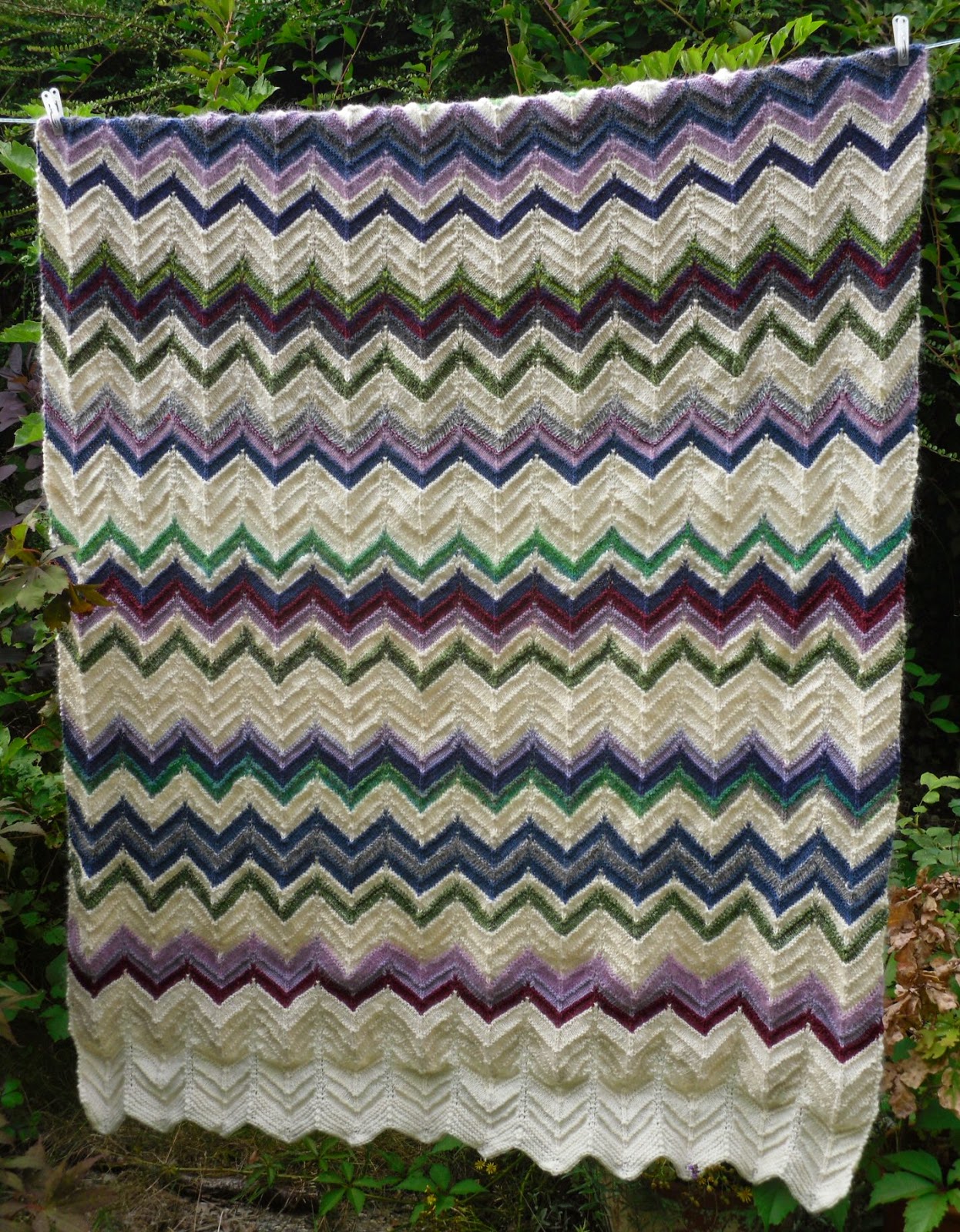
I finished a knitted blanket this week (19.08.14) which has taken a number of months to finish, using hand spun, commercial yarns, some dyed others natural. Some of the handspun is thinner than others and I used a steady needle size throughout - around 3.75, so it is quite dense in places and thin in others. There is handspun yarns acid dyed, dyed yarns using Koolaid, some commercial coloured yarn, but I guess around 60% or so is handspun. I did not spin it all, some came from table top sales with my guild and sales of leftovers by people who were having a clear-out.

The pattern is a simple zigzag stripe. I tried to spread the colours evenly across the blanket so there were no clusters of say, pink or green. It seems to have worked all right, the things is very heavy due to the denseness of the yarn and its size; although I haven't measured it, it must be around 2 m long as it is longer than I am. Folded up it will take up a fair bit of space, so it will take up a fair bit of space in my work room where I am planning to use it in the winter.

Tuesday, 12 August 2014

Tex1 Ass 2 Project 5 Stage 4 Reflection points on printing

Do you feel you made a good selection from your drawings to use as source material for your design ideas? Which interpretations worked best? Why?

Yes and no. I am not sure I had the type of drawings in my store that suited developing repeat designs, which is why I tried out a design process on a picture of a rusty metal surface which became the stencil design. This worked well, and the negative images from the cut-outs from the stencil were even better, they were organic, fresh and felt quite balanced in the compositions I made.

Which fabrics did you choose? What particular qualities appealed to you?
When printing smooth surfaces work best. They allow the printing block, equipment or tool to leave defined marks, whereas heavier textured fabrics take print more loosely. That is also the case for painted fabrics when you have to pin down the surface before painting. I liked the shiny acetate for taking very fine detail, and its shiny surface was useful for reflecting light through the matt paint used in printing. If printing on pre-printed fabric I think you have to select a design very carefully to make sure the contrast does not clash and create an imbalance.


Is the scale of marks and shapes on your samples appropriate to the fabric? Would any of your ideas work better on a different type of fabric, for example, sheer, textured, heavyweight? Why?
Printing and painting on smaller samples seems to be just the first step, it does not always give a good impression of what a run of repeats for example would look and feel like if planned for use. I re-discovered monoprinting and this does not allow for repeats and tried it on different surfaces, a very light, almost translucent cotton, heavier cottons, a woven wool, the lighter (but not the lightest) cottons (and probably a firmly woven linen) were best suited for this.

The prints using foam blocks rendered only low reliefs so were best suited for very smooth fabrics, while painting on fabric can be done on a variety of weights. I like the calligraphic effect of painting with a dark colour, letting the brush almost dance over the surface like I did for the red silk samples. This worked well on lighter fabrics. 

Do the marks and shapes seem well placed, too crowded or too far apart? Were you aware of the negative shapes that were forming in between the positive shapes?
In the stencil marks the negative spaces were a bit too far spaced out. It was printed on a white cotton and so I felt something was missing and wanted to fill the white space with something, such as stitching. I have to admit I have not been looking at the negative spaces too much, although some of the better monoprints had an interesting balance between the location of marks and the areas that only reflected areas of dye, but this is not what is being asked for here.

There was more use of negative space in the large sample where I intentionally discharged some of the background fabric so that the varying shades would show through (negative) areas where I did not apply dye on the plate.

What elements are contrasting and what elements are harmonising in each sample? Is there a balance between the two that produces an interesting tension?
The design elements of softness (eg in stamping with foam, rolls of yarn, soft paper) contrasts with the stamps made of rubbers, lines painted or dragged with pointed tools. There are contrasts in colour - eg black lines on red, use of complementary colours and between coloured prints and black backgrounds.

Harmony is more achievable by using similar shapes such as round forms (in one print using different round tools such as toilet rolls and wine bottle corks), or similar dynamic lines (such as swirling lines in the red silk painting).

The sampling of the smaller work also definitely prepared this work, although I did not recreate any earlier designs. The smaller monoprints, the stamping, the painted bonding material all provided a bit of learning of how the prints would work.


Do the shapes and marks in your single unit sample relate well to the size and shape of the fabric? Do they make an interesting composition on this larger scale?
Yes, as I planned a seascape I placed the sea and sky on each half of the sample with a horizon line cutting through them. I wanted the image to fill the whole of the fabric space which is rectangular. Although I did consider whether I should make the sky the feature as I had done in a photograph.

The marks were free and loose to evoke ideas of clouds and waves, and I think this worked well. In the final sample I am quite satisfied with the sky. I have looked at it close, and thought maybe I should have sewn onto the sky section, but no, I left the print as it stands. The marks are painterly, but not painted directly onto the fabric ground. It might be thought that this could have been painted instead of printed – and would it have made much difference? I am not sure; I used the roller to create direction in the paint-dye, I scraped at the dye, dotted with a brush and then lay the fabric onto this. I think it gives a particular textiley surface rather than a painted one.
How successful do you think your larger sample is? Do you like the design? Have you recreated or extended your ideas from the smaller samples so that there is a visible development between the two?
I am glad I looked at Barbara Rae’s work for this one to take in a sense of mark making in a large way. I like the blues and greens, the sea and sky – the motif retains enough of a sensation of the air I felt over the summer by the sea.

 The sampling of the smaller work also definitely prepared this work, although I did not recreate any earlier designs. The smaller monoprints, the stamping, the painted bonding material all provided a bit of learning of how the prints would work
 

Monday, 4 August 2014

Miscellaneous - films, books - anything - that made an impact

I think that textiles artists, or anyone interested in cultural production, benefits from looking wide and enjoying the gifts others put into the world. Be it theatre, literature, fine art, cinema or photography there is so much to pick up and look at, sometimes again and again, to learn and expand from.


Film

I enjoy the cinema and try to get out to see what seems intriguing or might be inspiring. I like fantastical films, but not fantasy sci-fi; humorous films, but not slapstick or poorly conceived fast-food and drunkenness jokes; and good documentaries, and more........

It would be easy to write about a lot of films, but this year, in the last 7 months, I have seen two I really loved and that made an impact on me.

The first one was Wes Anderson's Grand Budapest Hotel. A rambling, funny film, highly stylised and aestheticized, but full of cartoonish baddies, wild escapes, and people who you felt very fondly for like Ralph Fiennes' character, the Hotel concierge Gustav H, and his younger sidekick, Zero. The performances were great, and Fiennes showed a side I had never seen before, a funny, fast and intense side, that contrasted with his often intense, but darkly serious roles. 

I will not spend much time on describing the plot, that can be found on Internet Movie Database, but just to say, that I thought this was one of the best Wes Anderson films I have seen so far, having seen a number of these, and have sat through Life Aquatic with Steve Zissou many times (which I also enjoy very much). There were style elements I had seen in Fantastic Mr Fox, but mostly it was fresh and somehow quite poetic, if a comedy can be that.

The second film that affected me in some way was a documentary, Finding Vivian Maier. I had not heard of her work, although it seems an exhibition of her photographs has been shown in several capital cities in Europe, including London. This film covered the life of a hitherto unknown amateur photographer, who ceaselessly photographed everything she saw in her life walking through street of New York. She was a nanny working in the 1950s for several decades working for the more well-to-do, and throughout that time she never stopped taking photographs. And what work: amazing studies of people, streets, actions, the macabre, the odd, the poor, the rich, just everything that she came across, and sought out in the city. This work is termed street photography, apparently, but there were portraits, ethnographic studies from a trip around the world and cinefilm - this was the broad set of categories she covered.

The film sought to understand her by investigating her life, and give her recognition, posthumously, in the history of photography. There was so much in this film to think about: a life lived anonymously - so contrasting to the lives many live now, where baring your everything on the internet is common practice. And the work was just fantastic. At university I did a couple of courses on the history of photography, and the American portraitists, like Diane Arbus, did do interesting, unsettling work that still stirs people - Vivian Maier's work fits well into this history. Needless to say, I went straight home and bought a book of her work.

Books

For a while I have not been able to concentrate on reading in a focussed way for pleasure. But I came across Mark Twain's The Adventures of Huckleberry Finn in a charity shop and thought this might be good holiday reading. A what a great book: it is funny, sad and serious in turn; it has a rich humanist tone running throughout, and the warm Mississippi weather, the flowing river, all of it make for amazing tales of danger and daring do. It was a kind of 'road movie' tale of two men, one young, one older, one white, one black (and escaped slave) in a pre-civil war American South. The language was warm and reflective, and Mark Twain involves the reader through his tone, his wit and brings you with him when Huckleberry Finn ponders the moral lessons of life that has been imposed upon him by others, or discovers for himself. This book is the sort of thing I think of as gift to us, something precious, that speaks beyond its own time.   

Wednesday, 30 July 2014

Tex 1 Ass 2 project 5 stage 4 - a larger sample

Late July

I have been pondering how to finish off on a high with this assignment, having enjoyed the colour and design work, but struggled with the printed work. I have revisited Barbara Rae's work, as her landscapes are full of life, colour, energy, and I see her free improvised style as something that resonates with how I work as well. The book I used was Barbara Rae Sketchbooks, Royal Academy of Arts, 2011.

I went for a bit of a holiday to a place I feel strongly about and thought perhaps having Rae's work in mind whilst looking at the large skies over the sea where I was might inspire me.


I had also done just a few holiday sketches sitting on the beach, a couple at sunset, and one of the coastline.


So, having thought about this a while during my holiday abroad I decided to do a printed-painted landscape. I approached it a bit more systematically than I had the sampling sessions earlier in the project.

I thought perhaps it was better to think about layering various printed and painted mark making approaches, and started off by creating two bunches of small samples. The first one was using bleach to fade out painted areas.

 
This was useful, as it showed how different fabrics reacted differently to the discharge fluid (bleach) - some very well - the top two, which were respectively acetate and a poly-cotton, and less so the other two, below, a heavier grey cotton and a darkish green poly-cotton. The acetate bleaches almost instantly and the fluid runs quickly, so it is difficult to control the brush marks suing bleach on this fabric. A fifth piece was a wonderful piece of lining fabric I found in a charity shop (a small corner of it is showing to the right): a light-weight fabric in a good blue, made in Japan, which I thought perhaps might be silk, but it did not fade at all despite heavy application of bleach. So it is more likely to be a synthetic, but of a good quality. I had already decided I would probably use the acetate. It is has body somehow, whilst being a smooth and slightly precious looking fabric. It took print very well during early sampling, and despite being a pale green I think with prints in blue, white and blue-greens, and possibly a bit of brown, it will be a useful background for a seascape.
 
The second set of small samples were to test printing and painting on the same set of fabric types.

 
Here I liked the grey cotton, which was painted with blue and white mixed to varying degrees. Of course the sky would not be a summer sunny sky, but it looks good as a post-thunderstorm sort of sky. The pale green acetate still worked well, and the monoprint lay comfortably on all samples as they had smooth surfaces. I have not tried to print on top of the bleached samples and will just go for that for the final piece (I have a bit more of the acetate left if the print-on-faded-areas does not work as well as I am hoping. This is part of working experimentally, so it will just have to be tried, to see if it works.
 
In the end I printed three large samples, of which one was chosen as the final piece. First I bleached out areas on the fabric pieces for the two halves - one with waves the other cloudy:


The lower one shows how the bleach slipped off the brush and left the marks from the fluid - this would not matter too much as the print would be placed on top of this.
 
There were also two 'what was left on the pallet' prints, which I used to print the left-overs, ghosts, from the plates of the larger one. In printing first the sky, there was little to worry about with regard to registration with other printing, but when I came to print the 'sea' section it was much more difficult to hold the fabric to accurately place it on the plate. In one case there was a bit of overlap of the print, but this actually does not look too bad.
 
Once both the sea and sky sections had been printed covering the whole of the fabric, I fixed the fabric paint and left it a while as I needed to make the horizon distinct and needed to think about this a while. In the end I made a simple print on the horizon of two of the larger pieces, just using a strip of cardboard which I textured by scratching the surface.
 
Here's the final sample:


The final piece was then applied with waves in painted bonding material and embroidered waves of different sizes. The sky was left without stitching as the print was quite strong in itself, and I do not like to over-work the surface when it is not needed. Finally the piece was made stronger by ironing on Vilene and it was sewn onto a piece of blue cotton to bring out the blue in both the top and the bottom sections of the picture.


Hopefully this detail shows the bonded paint and the embroidery. Unfortunately photographic pictures distort colouring - I used greeny-blues and a bit of brown for the sea that was dark, but also gave it a warm feel, which is not so clear here, where the blue and brown dominate. The horizon line was a stamped section using distressed cardboard. This worked well, it created a clear line and with a little embroidery to indicate softer outlines of wooded land it evoked what I saw in the distance.
 
I also hope that the effect of the monoprint is visible - the plate is smooth, you roll out dye-paint, work in textures by scraping or some other way of mark making. When smoothing out the fabric over the print plate the dye may be pulled a bit, and that adds to the effect sometimes. This makes the printed marks very complex and in this case was useful as waves may at times be even but in the sea there is so many effects from currents, different depths of water that the surface is rippled and light fractures in different directions.
 
As a sample this final thing is reasonable, it does not claim to be a finished piece and was a useful exercise for showing how printing-painting can work with the substance of the fabric surface.
 
What was left on the print plate?
 
Three sections of sky 'ghost' prints were printed on top of each other. I then added a bit of painted sea and printed a coast line using distressed card.
 
 
The other was a sample with three levels of 'ghost' prints of the sea sections:

 
 Both these samples will be used for further work at some point, not yet sure what for though.

Monday, 28 July 2014

Exhibition visits during assignment 2 – Spring-Summer 2014

June

Matisse – Cut  outs at Tate Modern
This was one of those blockbuster shows that Tate Modern puts on that draws large numbers of people. The exhibition space was very busy and hot, but there was also a lot to be studied and looked at. Thankfully the works were mainly large so you could see them fairly well at a distance. Matisse worked with large scissors, cutting into gouache painted paper sheets. In a film shown in the exhibition he was seen chopping this paper, with an assistant holding the paper as he went on with his work.

Apart from the wonderful colours, the lively and life affirming shades of green, yellow, red and blue and fantastical oceanic or lush paper verdures and flowery collages, what struck me most of all was the energy Matisse seemed to have to get all this work done. He was elderly at the time of all this work, he had been very ill, and still looked unwell, sitting in his wheelchair, and nevertheless he managed to create one large scale work after the other, almost frenetic with work and energy.
This was what amazed me most. Of course the work was interesting: here were those images you see in poster sales at universities, but here there were pencil lines and piercings from pins apparent on the paper, not necessarily visible on cheap posters. These lines and pin holes showed how he had worked on composition, and again in a film footage you saw an assistant holding up strips of paper against a design for a cope; she was looking at him whilst moving the strip in tune to his demands for accuracy in where it should be placed. The work was very colourful and aesthetic, organically fluid shapes suggesting leaves, flowers and human (female) bodies covered large areas of wall. You came out feeling light and as full of summer as the weather was on the day I went. It was a fine exhibition with much to ponder….

 
Contemporary Ceramics gallery, London
Just briefly – I went to this gallery before going to the Vikings exhibition at the British Museum across the road. I love ceramics, the variations in glaze texture, colour of glazes and the clay or stoneware material, and the sense of a material handled and formed. There were many fine things there, simple, minimalist style vessels, pots that aspired to Japanese glazed aesthetics, and sculptural things. Whether large of small, many vessels were fine. I have a preference for the Far Eastern aesthetic and like to see how the ceramicist works with the glaze material, the events developing the finished object in the kiln, and was pleased to see pots by Margaret Curtis, who works in this way. In contrast Kyra Cane’s work was fine, almost transparent in its simplicity. Her vessels in the gallery were very pale, with a drawn line, but inside, in the bottom of the vessel you found a bright yellow glaze, as a little gift or surprise to anyone looking inside it.

Vikings – life and legend - the British Museum
Although not showing much relating to textiles in this exhibition, I was looking forward to it very much. At times I seek out some of my Scandinavian roots in Viking mythology and Icelandic sagas, which are fascinating tales of lives lived in harsh conditions and wildly fantastical imaginations. And the exhibition was very good - there were many artefacts from Scandinavian museums, German and various Russian and Ukrainian collections. One problem was the large amount of people blocking sight of some artefacts and labels in the early parts of the exhibition. The display was thematic, showing objects devoted to for example trade, the idea of the warrior and the culture of travel and conquest (a large boat had been lent by the Roskilde Viking ship museum) and religion. There was a small ‘meet the ancestors’ section, and plenty of pieces, including large gold jewellery items, that showed Viking designs and how they transformed in encounters with other cultures.

I was particularly interested in the small section on religion because this was one of the area that explicitly involved women's culture; a couple of metal staffs were explained as belonging to spiritual women, who may have been sorceresses. The Museum showed items found in such a woman’s grave, where plant stuff had been found that could have contained hallucinogenic properties.

Surprisingly I also found that a silver object I had seen photographically reproduced on the Internet possibly of Odin and his ravens, Hugin and Munin, was a tiny little charm sized object. The craftsmanship of the Vikings was amazing – the level of skill and insight into materials was quite outstanding in some of the objects on show. If there had been fewer visitors and more time to stop and ponder objects I would have gained more from the exhibition, as it is I was still pleased to have seen the objects and will continue to dip into the Viking culture and wold view for inspiration.

July
Dansk Gobelinkunst, Trapholt (design museum), Kolding, Denmark

Dansk Gobelinkunst is a group of Danish tapestry weavers who work on and promote contemporary tapestry art. The work they do is very varied and spans images from the abstract to the more illustrative. They concentrate on wall hung pieces and in the exhibition I saw there were no free hanging pieces, and neither were there any that used 3D forms.

There was much to admire in this exhibition though; I really enjoyed looking carefully at some of the work, and seeing them in the flesh rather than in pictures. I have a number of catalogues and monographs on tapestry artists, and in photographs this type of textile work loses a lot. In real terms the tactile nature of wool, silk or linen is more apparent, the subtle use of colour or certain techniques becomes much clearer.
I have a personal preference for abstraction, and the graphic in textile design, and there were really good pieces here that looked at thematic ideas and pulled out essences of things, such as Anet Brusgaard’s Tatouage II, which was a black tapestry with a design inspired by body scarring and tattooing from African tribes. The black was a matt and receding wool, but each ‘scar’ was a dot woven using gold and coloured metallic threads. This worked very well and cannot be appreciated from any photographs I took.

Other work I enjoyed very much was Anette Graae’s the heaven/sky above me (Himlen over mig) Anne Marie Egemose’s The Barrows at Høje Bjerge (Jordspor-højene i Høje Bjerge) and Hanne Skyum’s Black Crows (Sortkrager). All the tapestries in the exhibition seemed to follow a craft tradition of engaging with the material of fibre and colour, but they still engaged interesting themes and symbolism, and the three mentioned here looked at ideas that I have been exploring myself (crows and barrows) or used the warp as well as the weft in the design (as does Berit Hjelholt, whose work was not in the show, but which is worth mentioning because it follows a similar Scandinavian design language of something spiritual in a symbolic visual language). This use of the exposed warp and weft in design was taken to a further level by Anne Bjørn, whose work was an open weave using white and yellow linen that was mounted some distance from the wall. This allowed the thread to throw shadows onto the wall behind the work. I wonder how this type of work is kept stable in transport and moving the work, the lacy effect makes it look quite fragile and vulnerable.

Relating tapestry weaving to assignment 2
Tapestry is a slow and deliberate process that deals with construction and the structure of the fabric. This is a technique being covered in a later assignment and contrasts very much with printing, which is a surface process (part of ass 2). Printing and surface design is a particular process which requires planning and consideration of lay-out, but so does tapestry. What differs more radically between the two is the purpose of these disciplines: printing is potentially a surface technique emphasising pattern, for fabrics to be used in furnishing or fashion. These fabrics will be cut up and shaped into a final object, whilst the tapestry is the final thing, often painterly, it is a means to combine the artistic idea within a structure.

When sampling for tapestry or other constructed techniques a relatively long time is spent on just a single sample. whilst I found in sampling for print that you have to work fairly fast (as the paint dries up), and you can make 10-15 samples in a couple of hours once all materials and tools have been set up. This may have something to do with the modernity of print as we now experience it. Tapestry weaving is a very old technique, more than a 1000 years old, and although there are technical routes to faster weaving techniques (I am thinking of the jacquard looms that make up Grayson Perry's tapestries, less of cloth weaving machines), the traditional technique is slow. Printing on the other hand, although maybe also old - wood block printing has been used in Asia for centuries - in the West much printing is now done by machines, for fashion and furnishing use. There are of course other printing styles, more artistic endeavours, using layering and various techniques, however this is still fast compared to some tapestries that can take a year for a weaver to make.

I guess this is an unfinished discussion, as I feel there is more to say about surface decoration, including batic, shibori and other means of bringing pattern to the surface of cloth, however that is perhaps for another time.

Tuesday, 1 July 2014

Tex 1 Ass 2 Project 4 Design, textile print and painting

Having had a good and full day of printing I returned to a design exercise I had worked when I had exhausted some of the derivations from selections of drawings. I interpreted a small selection from a photograph and reflected on it in different ways:

 
Drawings of positive and negative shapes in pen and graphite. Here the focus was on shapes, as I interpreted some of this exercise as wanting us to do this - make a selection of something that might be repeatable. I also made a small collage-type assembly of paper shapes for this one:
 
 
I made up a stencil for this and tried it out on some cotton fabric in a couple of colour ways. These look unfinished and would need some embellishment in the white areas - I thought I might do some machine embroidery perhaps, or do a watery paint to soften the lightness of the ground - the contrast is a bit too stark here:
 
 
I also used the cut-out sections as a negative stencil, which worked very well, I like this very much, and here the left one is shown as a 'tree' although that was not the original intention, it was purely a test:


A couple of reflections on this little exercise
 
Print is beyond my comfort zone, although I enjoyed the spontaneity of the monoprinting and working on the rubbers to make blocks I found the discipline of the design exercises difficult. They didn't seem to harmonise with the pictures I might have in my head, and the design process leads the design result more than the outcome I had ideas for.
 
That is probably why I reverted to the free experimental day of just trying out techniques. I am much more versed in constructing forms, three dimensionality and large scale things. The print work seemed to call for smaller scale and two dimensionality. The focus on surface stands in contrast to my previous and continuing interest in structure. I will be on more steady ground with the next assignments.
 
A detour: To get inspired I looked at some print work by the Omega workshops, Wiener Werkstaette and Sonia Delaunay. The turn of the century design work in Vienna was great, I love the clarity of design they developed, it is quite defined and a precise. This stands in contrast to the looser work of the Omega workshop, which sometimes looks unfinished next to the Viennese work. Delaunay came later and is more definitely modernist in her expression, colourful, geometrical shapes. I also looked at some contemporary work by Marimekko and Klaus Haapaniemi. Haapaniemi's work is very different from the stylised geometry of modernist simplicity; it is narrative, illustrative and very detailed.
 
Nevertheless I still had to attend to my own print work and during this short exercise it became clear again, that I used a painting style with the stencil. The open areas of the stencil were large and needed to be covered, I used a dabbing and painting style, thought about whether a roller would have covered the surface more evenly, but then I like the uneven spread of marks and colour created here.
 
And in the end serendipity had a role in this work too; with the benefit of the negative shapes being used for smaller samples that have a organic aspect to them they were not planned or designed for but made pleasing pieces in themselves.