Wednesday 20 August 2014

Tex1 Assignment 3 Project 6 - Manipulating fabric - prep and drawings

Stage 1 Preparation

This stage asks for a review of fabrics that we may use in projects, samples etc. I do not have a large table and far too many fabric pieces to be able to show here, so I have narrowed this illustration to three colour themes. There are a multitude of textures, tweed, felt, satiny fabrics, cottons and linens in different weights, silks, printed pieces, jerseys and pieces/sections of metallic effect fabrics.

There are also yarns in similar materials, woolly tweedy yarns - strong and weak, fluffy or smooth - silky silks and synthetics, strong linens thick and thin, paper yarn, sewing and embroidery threads, ribbon, homemade cords, basically all manner of things that can be used to stitch, knot, wrap, weave, loop and so on.

Blues - vintage cotton thread I dyed, grey alpaca wool, sewing threads, herringbone wool fabric, felt, knitted cotton thread, printed grey furnishing fabric.


Greens and reds - and old tie, pink linen thread and thin cotton, red silk, purple mohair, green paper yarn, silk, green-brown felt and acetate, some greeny-brown tweed.

 
Yellow, whites, oranges and brown - hessian, silk and silk paper, linens, synthetics sewing thread and wool.


So there is plenty of materials to draw on. There is plenty to think about when designing as well: for layering, texturing, scrunching, smoothing out. The key challenge is to think about designs and purpose of the work.

Stage 2 Developing ideas

This part asks us to continue designing. The suggestion is to select six images and work them up using the process introduced in the previous assignment. I have started this by turning to some photographs I took at different times - winter snow, a wooden door - and worked up an image of feathers. As the next step asks for samples in applique I think the lines of the drifting snow would be good to trace using layered fabric and stitch, or cutting out feather shapes in fabric and creating a collage of appliqued feather shapes.

Blue feathers in coloured pencil and watered down inktense.


Blue feathers in scratched-into blue-green oil pastels. This was a bit 'thin' for design purposes, a bit too subtle. I am not sure the pattern shows up very well here.

 
Green feathers in inktense and water soluble pencil - watered down and mixed, greens and yellows.

 
More feathers in a collagy composition
 
 
Here's a sample from stage 3 (left) - appliqued fabric, some elements just placed, a few bonded with bondaweb and all stitched to suggest the leaf outlines (silks, acetate and nylon organza)

 
The original photograph of subtle snow drifting areas, some blue, a bit of brown, white and greys.
 
 
Abstracting the snow picture using a blueish background in thinned out inktense with layers of tissue paper. This no longer looks like snow, but is interesting, I quite like this.
 
 
I am putting the sample here for reference - we were asked to play with fabrics, layering etc to get a feel for a selected sample. In the end I made two - this one in organzas, poly-cotton and a synthetic wadding that suggested snow:
 
 
 A door in the old part of Stockholm suggests layering and relief, could be used to think about thick sections of fabric and quilting:
 
 
A variation in different colours and to a different scale:


Here's the source picture and another variation. When I came to do a detail I got some proportions and dimensions wrong, but it kind of could still be used, need not look like the original source. It is a bit of a distraction to have the source photo on the same page spread as the detail drawing.


After a little break I decided to get into designing by doing some collages. Some using paper, some using mixed media:

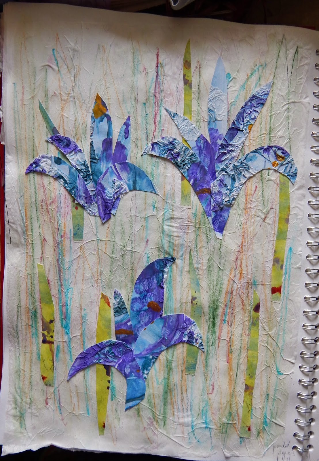
Painted tissue paper glued as background, prepared papers in shapes.


Scrunched-up tissue paper, silk fabric, inktense scribbles


Glued-on tissue paper, paint, string painted


Collages using seeds and imitating these in paper:


Round shapes in tissue paper and plastic from a carrier bag, shell and whiteish paint mixed with PVA
 
The course material asks us to select 6 pictures. I think some of the above, would be useful. I like some of the snow pictures, the feathers, the door in pastel colours and some of the collages, especially the one with round shapes.


Wednesday 13 August 2014

Other things done on the side

Alongside the course work shown here, I do a bit of work on the side. The course takes up a lot of time, so there is little time to create much, but I have been knitting and dyeing on the side.

Over the summer I dyed in rhubarb - this gave different shades of yellow-green, and I also modified a skein in iron, and over-dyed some in indigo.

Pictures to follow.


The local Guild of Weavers, Spinners and Dyers, which I am a member of, had a dyeing day and I had an opportunity to dip a shibori-style tie dyed pashmina in indigo. The ties where a poly cotton around pebbles of stone, and the square resist areas are unplanned, I did not foresee that these areas would be square like this, all I did was select stones in approximately the same sizes and tie thread around them. I am now wondering whether I should embellish this in some way. The pashmina was white with a subtle woven pattern which was brought out by the dye. This means the tie-dye clashes slightly with the weave and I think this clash needs to be brought out/harmonized further by embellishment....
this is still to come.


I finished a knitted blanket this week (19.08.14) which has taken a number of months to finish, using hand spun, commercial yarns, some dyed others natural. Some of the handspun is thinner than others and I used a steady needle size throughout - around 3.75, so it is quite dense in places and thin in others. There is handspun yarns acid dyed, dyed yarns using Koolaid, some commercial coloured yarn, but I guess around 60% or so is handspun. I did not spin it all, some came from table top sales with my guild and sales of leftovers by people who were having a clear-out.

The pattern is a simple zigzag stripe. I tried to spread the colours evenly across the blanket so there were no clusters of say, pink or green. It seems to have worked all right, the things is very heavy due to the denseness of the yarn and its size; although I haven't measured it, it must be around 2 m long as it is longer than I am. Folded up it will take up a fair bit of space, so it will take up a fair bit of space in my work room where I am planning to use it in the winter.

Tuesday 12 August 2014

Tex1 Ass 2 Project 5 Stage 4 Reflection points on printing

Do you feel you made a good selection from your drawings to use as source material for your design ideas? Which interpretations worked best? Why?

Yes and no. I am not sure I had the type of drawings in my store that suited developing repeat designs, which is why I tried out a design process on a picture of a rusty metal surface which became the stencil design. This worked well, and the negative images from the cut-outs from the stencil were even better, they were organic, fresh and felt quite balanced in the compositions I made.

Which fabrics did you choose? What particular qualities appealed to you?
When printing smooth surfaces work best. They allow the printing block, equipment or tool to leave defined marks, whereas heavier textured fabrics take print more loosely. That is also the case for painted fabrics when you have to pin down the surface before painting. I liked the shiny acetate for taking very fine detail, and its shiny surface was useful for reflecting light through the matt paint used in printing. If printing on pre-printed fabric I think you have to select a design very carefully to make sure the contrast does not clash and create an imbalance.


Is the scale of marks and shapes on your samples appropriate to the fabric? Would any of your ideas work better on a different type of fabric, for example, sheer, textured, heavyweight? Why?
Printing and painting on smaller samples seems to be just the first step, it does not always give a good impression of what a run of repeats for example would look and feel like if planned for use. I re-discovered monoprinting and this does not allow for repeats and tried it on different surfaces, a very light, almost translucent cotton, heavier cottons, a woven wool, the lighter (but not the lightest) cottons (and probably a firmly woven linen) were best suited for this.

The prints using foam blocks rendered only low reliefs so were best suited for very smooth fabrics, while painting on fabric can be done on a variety of weights. I like the calligraphic effect of painting with a dark colour, letting the brush almost dance over the surface like I did for the red silk samples. This worked well on lighter fabrics. 

Do the marks and shapes seem well placed, too crowded or too far apart? Were you aware of the negative shapes that were forming in between the positive shapes?
In the stencil marks the negative spaces were a bit too far spaced out. It was printed on a white cotton and so I felt something was missing and wanted to fill the white space with something, such as stitching. I have to admit I have not been looking at the negative spaces too much, although some of the better monoprints had an interesting balance between the location of marks and the areas that only reflected areas of dye, but this is not what is being asked for here.

There was more use of negative space in the large sample where I intentionally discharged some of the background fabric so that the varying shades would show through (negative) areas where I did not apply dye on the plate.

What elements are contrasting and what elements are harmonising in each sample? Is there a balance between the two that produces an interesting tension?
The design elements of softness (eg in stamping with foam, rolls of yarn, soft paper) contrasts with the stamps made of rubbers, lines painted or dragged with pointed tools. There are contrasts in colour - eg black lines on red, use of complementary colours and between coloured prints and black backgrounds.

Harmony is more achievable by using similar shapes such as round forms (in one print using different round tools such as toilet rolls and wine bottle corks), or similar dynamic lines (such as swirling lines in the red silk painting).

The sampling of the smaller work also definitely prepared this work, although I did not recreate any earlier designs. The smaller monoprints, the stamping, the painted bonding material all provided a bit of learning of how the prints would work.


Do the shapes and marks in your single unit sample relate well to the size and shape of the fabric? Do they make an interesting composition on this larger scale?
Yes, as I planned a seascape I placed the sea and sky on each half of the sample with a horizon line cutting through them. I wanted the image to fill the whole of the fabric space which is rectangular. Although I did consider whether I should make the sky the feature as I had done in a photograph.

The marks were free and loose to evoke ideas of clouds and waves, and I think this worked well. In the final sample I am quite satisfied with the sky. I have looked at it close, and thought maybe I should have sewn onto the sky section, but no, I left the print as it stands. The marks are painterly, but not painted directly onto the fabric ground. It might be thought that this could have been painted instead of printed – and would it have made much difference? I am not sure; I used the roller to create direction in the paint-dye, I scraped at the dye, dotted with a brush and then lay the fabric onto this. I think it gives a particular textiley surface rather than a painted one.
How successful do you think your larger sample is? Do you like the design? Have you recreated or extended your ideas from the smaller samples so that there is a visible development between the two?
I am glad I looked at Barbara Rae’s work for this one to take in a sense of mark making in a large way. I like the blues and greens, the sea and sky – the motif retains enough of a sensation of the air I felt over the summer by the sea.

 The sampling of the smaller work also definitely prepared this work, although I did not recreate any earlier designs. The smaller monoprints, the stamping, the painted bonding material all provided a bit of learning of how the prints would work
 

Monday 4 August 2014

Miscellaneous - films, books - anything - that made an impact

I think that textiles artists, or anyone interested in cultural production, benefits from looking wide and enjoying the gifts others put into the world. Be it theatre, literature, fine art, cinema or photography there is so much to pick up and look at, sometimes again and again, to learn and expand from.


Film

I enjoy the cinema and try to get out to see what seems intriguing or might be inspiring. I like fantastical films, but not fantasy sci-fi; humorous films, but not slapstick or poorly conceived fast-food and drunkenness jokes; and good documentaries, and more........

It would be easy to write about a lot of films, but this year, in the last 7 months, I have seen two I really loved and that made an impact on me.

The first one was Wes Anderson's Grand Budapest Hotel. A rambling, funny film, highly stylised and aestheticized, but full of cartoonish baddies, wild escapes, and people who you felt very fondly for like Ralph Fiennes' character, the Hotel concierge Gustav H, and his younger sidekick, Zero. The performances were great, and Fiennes showed a side I had never seen before, a funny, fast and intense side, that contrasted with his often intense, but darkly serious roles. 

I will not spend much time on describing the plot, that can be found on Internet Movie Database, but just to say, that I thought this was one of the best Wes Anderson films I have seen so far, having seen a number of these, and have sat through Life Aquatic with Steve Zissou many times (which I also enjoy very much). There were style elements I had seen in Fantastic Mr Fox, but mostly it was fresh and somehow quite poetic, if a comedy can be that.

The second film that affected me in some way was a documentary, Finding Vivian Maier. I had not heard of her work, although it seems an exhibition of her photographs has been shown in several capital cities in Europe, including London. This film covered the life of a hitherto unknown amateur photographer, who ceaselessly photographed everything she saw in her life walking through street of New York. She was a nanny working in the 1950s for several decades working for the more well-to-do, and throughout that time she never stopped taking photographs. And what work: amazing studies of people, streets, actions, the macabre, the odd, the poor, the rich, just everything that she came across, and sought out in the city. This work is termed street photography, apparently, but there were portraits, ethnographic studies from a trip around the world and cinefilm - this was the broad set of categories she covered.

The film sought to understand her by investigating her life, and give her recognition, posthumously, in the history of photography. There was so much in this film to think about: a life lived anonymously - so contrasting to the lives many live now, where baring your everything on the internet is common practice. And the work was just fantastic. At university I did a couple of courses on the history of photography, and the American portraitists, like Diane Arbus, did do interesting, unsettling work that still stirs people - Vivian Maier's work fits well into this history. Needless to say, I went straight home and bought a book of her work.

Books

For a while I have not been able to concentrate on reading in a focussed way for pleasure. But I came across Mark Twain's The Adventures of Huckleberry Finn in a charity shop and thought this might be good holiday reading. A what a great book: it is funny, sad and serious in turn; it has a rich humanist tone running throughout, and the warm Mississippi weather, the flowing river, all of it make for amazing tales of danger and daring do. It was a kind of 'road movie' tale of two men, one young, one older, one white, one black (and escaped slave) in a pre-civil war American South. The language was warm and reflective, and Mark Twain involves the reader through his tone, his wit and brings you with him when Huckleberry Finn ponders the moral lessons of life that has been imposed upon him by others, or discovers for himself. This book is the sort of thing I think of as gift to us, something precious, that speaks beyond its own time.