Monday 30 March 2015

Sketchbook course - a small exercise alongside

I am aware that I have not been drawing as much as I should. There is simply not enough time left after working long hours and then getting on with the textile work. Anyway, I thought perhaps doing something on the sketchbook course (pre-textile degree course) might be useful, at least that will also get me looking at how different artists work and see whether there are new ways for me to move towards.
 
The first exercise was to describe a couple of journeys - one from memory and one from life. I first drew my journey to work, including roads, signs, aerial view 'maps', and fences.

However thinking about drawing a journey I do often from life just leaves me blank - so many journeys are taken by car and they are simply not inspiring, so I decided to do a 'portrait of a place' instead. A quiet place that I enjoy going to from time to time to find stillness and rest.

Making concertina books was quite useful. I am not that keen on the precision required in book making, but I am making a book for my last assignment, the theme book, and so think that it is worth pursuing making a number of these things and seeing if I can use them in different ways.

Here's one in progress with a couple of drawings of a rusty metal object.

 
And unfortunately I forgot my dedicated concertina book when I went to draw my 'portrait of a place', but I did take the one above, so that is what I used for my afternoon there:
 
First I drew a section of an old wall in watercolour pencils and then in oil pastels with sgraffito marks.
 
 
I quite like the scratched marks in layered oil pastels, you get subtlety and fineness even though the colours are strong


The other interesting thing about this method is that the stickiness of the pastels rubs off very feint marks on the page it lies against, so I left that page as it was:

 
And then, oh dear, my architectural drawing skills are terrible! I think this is why I fret about drawing, I feel as if my skills have not moved on since I stopped drawing as a child, and it is a bit embarrassing really.........
 
 
I feel happier with a more free style. It was a lovely spring day, with sunshine which shows greens as fresh greens and yellows as sparkly yellows. I sat there, on a folding chair and had a  go at the grassy area just below the wall:

 
Just to show you what the place really looks like (see my separate photo section on a different post):
 
 
A beautiful Norman chapel that was once part of a much larger priory. In the warm sunshine you can almost imagine being in France.
 
Second task
 

Then we are asked to customise a book. I got an old cookbook from the 1930s-40s which is not ageing very well, with yellowing pages, but it has a good hard cover. The idea is that we choose an artist an consider their painting style. From the artists we are to choose from I waivered rather between Ben Nicholson and Cy Twombly - Nicholson because his work seemed fairly varied and he is a  British 'modernist', abstracting his landscapes and using very subdued colours. In the end I chose Cy Twombly - I do not really know anything about him, and as his work seems to be about mark making I thought perhaps there was quite a bit of mileage in playing with various materials and incorporating textiles in it sometimes. His style is free, with sgraffito into heavy paints, very loose and wet open marks, doodle-like jaggedy or rolling marks, and interesting ways of composing marks. His style is 'organic' in an urban way, not about landscape, but of process and the organic growth of the work. A few videos on You-tube describe the work in more detail, and it is interesting that process seemed to play a large part in his expression. He worked at the time of US expressionism, and this is of course clear from the play with materials that shines through, and which is useful to think about when thinking about experimental textiles as well.

First I made some scribbles using gesso and a bit of sparkly glue-paint:


And here are some pictures from the book:


What's good about this book is that the text is mainly laid out in narrow columns and occasionally there are pictures of food on better quality, more shiny paper, which can be used as a point of reference for the marks.


Over time, as marks in the book are added there will hopefully be a sense of cohesiveness to it all - whether 'doodles' or 'images', they will be bound by the book's interior, and maybe become create a wholeness in the final thing for now it is a work in progress.


Saturday 28 March 2015

Tapestry weaving - thoughts

I am quite interested in tapestry weaving and am currently working on a presentation on 20th century tapestry and fibre art for my local guild of weavers, spinner and dyers. I wove tapestry in my teens, teaching myself by using some of those weaving books that followed in the wake of the 1960s-70 fibre arts movement, when more parochial textile artists opened out the techniques to a wider audience. In Denmark at that time (mid-80s), and currently, there was some recognition of tapestry art, and at that time experimental tapestry was a key feature. It seems to me that now tapestry has returned to a more traditional expression with an emphasis on imagery, narration and representation, where the yarns used are pretty much the same throughout and experimental techniques are kept to a minimum in the same work - see the work from the British Tapestry Group, Dansk Gobelinkunst, European Tapestry Forum and Norwegian tapestry via absoluttapestry.

Of course that is not the case for all weavers and artists such as William Jefferies uses different techniques throughout his pieces and one of my favourite weavers, Aino Kajaniemi, may use the gobelin technique, but she will use different materials in very subtle ways, such as using human hair for example. With the introduction of digital photography and manipulation techniques there is a movement to use photography as the basis for some tapestry designs, with motifs of a social or personal nature. The American Tapestry Alliance has some examples of these on their web-site. And otherwise very experimental work come out of design and art colleges, moving into conceptual and metaphorical understandings of tapestry - see for example the neon work by Astrid Krogh, whose work is described as tapestry but is equally work with light.

It is often said that tapestry is a weft-facing weaving technique. I guess this is said to distinguish it from cloth weaving, but when it is held dogmatically as a definition an interesting aspect of using the warp in the design is lost from sight. I would point to the work by the art nouveau weaver Frida Hansen, whose work sometimes used the warp in designs to suggest a kind of lacy effect, others let the warp show through over the whole of a piece as part of the language of the work, and this can be very beautiful, I particularly like the work by Berit Hjelholt, whose work is often large scale, but has a still centre - hers is the large piece hanging in the Danish Folketing, Som en Rejselysten Flaade.

On my bedroom wall I have a Wissa Wassef tapestry in yellows, oranges and reds with a few blue birds and white flowers on it. It is woven using mainly eccentric weft and so the surface of it undulates softly as the weave has pulled the fabric out of shape; perhaps not an intentional distortion but it fits well, organically, with the overall design of a large plant.
The strength of tapestry weaving is that as a beginner it is fairly straightforward to get some interesting results and I guess that may have been why Wissa Wassef used this to encourage locals in his town in Eqypt to express themselves through that medium.

Weave structures have been developed in many cultures using various materials, whether protein based fibres such as wool or alpaca or cellulose fibres such as various leave, reed or branches. This allows for structures in all manner of sizes and scales - even wattle and daub walls have a foundation of a woven structure of wooden lattice onto to which the wet earth of clays would have been laid. For a project in the past I looked at basket woven vessels and found that native American people had made watertight vessels to carry fluids. However I guess this assignment on weaving requires a focus on fabric-based weavings, but combining harder materials and textile based materials can create interesting things. North American fibre arts include basket making as part of its definition, and a famous example of an artist-basket maker was Ed Rossbach.

I have collected some interesting tapestry related videos into a playlist collection on youtube - there is a good one from France that shows the set up of the warp and the weaving of a tapestry, La Lesson de tissage.

So, what about my own work? Well, until now I have been working in the more traditional vein and even more just admiring other's works vicariously. Although there may be a lot of work to admire that others have made, I am not sure I have found my own language in the technique. Tapestry takes a long time to make and I am easily diverted - by knitting mainly.

Sunday 22 March 2015

Assignment 4 - starting the Textile Structures section - colour analysis

This assignment seems to me to be about the construction of textiles. It covers braid and rope making, plaiting and weaving. I had hoped there was something in there about knotting and  other free-form 3D work, but I may, if I have time, play around with that as well during this assignment anyway. There is a written research point about textile art, what it is and what it means in the context I assume of Western art.

Reading through the workbook there is something in there about the grid, working freely within the grid, but probably not overtly anything about working outside the grid, 'off the wall' as some writers describe it. The weaving is based on tapestry weaving, which is great, I enjoy working in that medium, and it does allow for all manner of experimentation with fibre, structure, qualities of threads, yarn and string, and colour.

I have chosen a workbook with black pages for this assignment. Black is very useful for framing work and it changes the way colour works when either painted directly onto it or mounted on to enable the black background to frame it - white makes things luminous while black makes things poised and sombre.

The workbook starts off with some colour exercises, to create examinations of works and analysing them in terms of proportion. I chose a couple of paintings by Gerhardt Richter, Cage (1) (2006) and Wald (3) (1990) both were shown at the Tate Modern exhibition in 2012.  I will link to the paintings found on the Gerhardt Richter web-site, and you can find the images there quite well defined. So, these paintings are in fact not so easy to analyse, and colour choices derived from them needed to be simplified. I had several goes trying to identify and mix paints, gouache, watercolour and water soluble crayons, to work out what would be useful to find the colours for the next steps. In the paintings Richter has applied the colours quite thickly and then pulled them across the canvas which has led to the colours mixing and giving both paintings a horizontal effect in the smearing of the colours. Sometimes it is possible to discern a distorted representation underneath this pulled paint, but I have tried and failed to see it in these two cases. Anyway, I like Gerhardt Richter's work, I find it well-thought-out, carefully considered and he uses beautiful colours in interesting ways.

Here are some examples of what I did to analyse Cage (1). The main colours in this painting are greens, some blue-green with darker shades and browns.

The first picture shows testing the colour medium and water colour paper I went on to use (it is quite grainy and was good for applying water-based media, but less good when trying to add more wet on wet, it started to disintegrate after a while):


This second picture shows a section of a collage I made. The painted page is more of a lay-out exercise working out where the colours sit in the painting. I also made a couple of yarn wraps to think about the colour distribution and how these would work out in textiles.


Wald (3) / Forest (3) (1990) contains a lot of blue, but there are many other colours in there - green (as a mix with the blue, so more of a blue-green), yellows, oranges, browns, a strange coral red (that I do not really have much of in yarn) and pinks, white as well as, what looks like greys.
 
Again I had a go at mixing colours and working out how it would work using gouache in various levels of viscosity, and then another collage to work on colour proportion and effects of how colours work together. I had to paint a bit of diluted black over it to make it darker in sections.

 
More testing paint and a section of testing paint on the black paper directly. The colours are dulled and the orange looks more mustard:

 
And here an analysis of how the colours lie on the painting as an attempt at working out proportions - luckily I found a bag of wools that contained that coral I didn't have:

 
Between the analyses of the Richter paintings I also gathered a collage of browns and earthy tones. I did a wool wrap of that as well:


Tex 1 ass 4 - Project 8 yarns and structure

Stage 1 Exploring the qualities of yarns

I have quite a large collection of yarns, as I am always on the look-out for interesting materials for textile work. For this module I made a small purchase of some thicker linens and cottons as well.

I am a spinner and so have a few wool tops and other fibres for spinning, including alpaca and some synthetics. For the stage here I will concentrate on what you can see on the photos:

 
From left: a ball of cotton postal string, cones of linen and cotton ribbon, rolls of cotton (for warp) and natural linen, sisal, hand-spun natural wools, and to the front a skein of nettle yarn. This collection is of natural fibres both plant based (linen, sisal and nettle) - cellulose based - and animal protein fibre (wool). The ones shown are in neutrals, but they can be dyed, and I am planning to dye some of the linens in dark blue and black for use later in the assignment.
 
Some of these fibres are coarse and hard to touch, they will produce quite rigid structures and so could be used to build large-scale pieces. During the 1960s and -70s artists such as Francoise Grossen used rope and string in knotted sculptural works.  Eva Hesse covered her ropes in latex and polyester resin. More recently Ruth Lee has used nettle yarn and other more rigid fibres in jewellery design.
  
 
Here you see various hand-spun and commercial wools and silks. I did not necessarily spin all of these, you can see the spinning is quite even and balanced; I spin quite loosely depending on the project and I rarely get the balance right in the ply (balancing the yarn has to do with how much or how little the yarn is over-plied, i.e. whether the tension in the single ply has been evened out by the plying process when the wheel turns the opposite way to the original spinning). The yarns here are of differing qualities: commercial crewel wool at the front, cotton chenille (right), some old rope found on a beach (far left). There is also some spun sari silk or banana fibre (purple, in the middle right).
 
Silk is quite soft and has a very high lustre. It dyes like wool. In the past it was seen as a precious fibre, but it seem now to be quite ubiquitous although still holds an aura of luxury. I find it a bit flat and flacid sometimes, if not mixed with other fibres  for use in garments for example. The nature of the silk depends on it origin, the species of silk worm and the way it is spun and woven.
 
Wool is a great fibre - it varies hugely in quality depending on the breed of sheep - from the very coarse wool of the herdwick sheep to the much finer merino. Some wools have a lustre to it which is enhanced by spinning it as a smooth yarn along the length of the fibre (almost as a worsted) - (Wensleydale wool is an example of a high-lustre wool I am particularly partial to). Cashmere and mohair are cut from goats. All these fibres dye well with acid dyes and natural dyes. Throughout history people have bred sheep to carry different types of wool for varying uses. An ancient Nordic breed such as spelsau has both a long hairy guard hair and a much softer inner wool - the guard hair may have been used for ropes and sails for ships whilst the softer inner wool would have been good for clothing and perhaps felted items.

 
More natural fibres, lambswool (in the large cone), silks, wool rovings for spinning or felting and the green to the left is synthetic, probably with viscose (a cellulose material).

 
This pile of spun and plied thicker yarns I made experimentally using wool, rayon and some feathers in different colours.
 
 
Close-up of a yarn plied with wools and a heavy linen.


Close-up of yarns (3-ply) using wools and rayon.

 
The close-up of yarn with feathers

A short note on synthetics: there are certain synthetic fibres that I am not too keen on - acrylic being one - it is fine for knitting when mixed with wool, but I am not sure about its quality for experimental pieces. I have seen installations using acrylic yarn, but it feels very ephemeral and has a sense of the 'plastic' about it that is less inspiring than natural fibres. Polyester is similar but from my samples in other assignments you will see that as cloth polyester has some admirable qualities that can help make interesting work.


Stage 2 Experimenting with structures

Exercise 1

This section is getting us closer to weaving within grids of various types, freeform and more fixed grids. To warm us up we are asked to weave papers and I made some to look at colour, texture of the papers and how the grid can be shaped internal to the structure.

 
This picture shows a large piece made of painted watercolour paper and a smaller one in a mixture of matt painted paper with a glossy section woven in. The larger piece was difficult to weave as the paper was quite weak, and I actually got a bit impatient with it and fretted about whether it would break, so I left the middle section unwoven, but anchored it down with a second section of weave. This means that under the unwoven slitted section the painted paper underneath can be seen, this is a useful effect - in fact slits are used in tapestry weaving in some cases to create relief and shading. The smaller piece shows what happens when the grid is made uneven, I cut the various section to different widths and waviness. Colour contrasts bring out the reds in the painted paper quite strongly.
 
When the pieces are laid out in landscape they change. I prefer the landscape format here in the smaller piece, somehow it enhances the verticality of each smaller pink sections within the grid. In tapestry weaving there is often a choice to made about whether a tapestry should be woven lengthwise or vertically as the weft threads and the way these are woven means lines are more clearly defined when woven on the horizontal - in paper weaving this is less obvious, and I have to say I found the technique to be very different from tapestry weaving; I think we are here being asked to look at what woven structures can do overall rather than thinking about the weft thread as a line to be woven in with other lines to make mass. In paper weaving the mass is integral to the whole anyway.
 
 I also wove another matt/glossy sample where the slits were cut straight only, but in various widths. I chose green tones to evoke the Richter painting I had looked at for the colour exercise:
 
 
Exercise 2
 

At this point I want to comment on the structure of the projects as they are described in the book. After the paper weaving exercises the book asks us to make some braids and ropes (although rope making is visually described in exc. 3). I find that an odd position, I would have thought that this would sit more naturally after the yarn analyses to show how different yarns work in ropes etc. as  combinations of 'thread as line', and then 'progress' to woven structures. I guess the book describes the braids etc. as a 'woven structure' - and I will add macramé knots to this to add a bit of variation from the flattish plaits. Anyway, l will add the braids here as expected from the book, but see grids and woven structures as a bit more distinct, almost as a prelude to tapestry proper.

For this exercise I referred to a book I got recently which is one of those popularising books on fibre art that came out in the wake of the big fiberart movement exhibitions in the 1960s, Beyond Weaving (Chamberlain and Crockett (1974)). It shows work by Ruth Asawa, Francoise Grossen and Claire Zeisler amongst others, and contains a range of techniques, mainly non-woven, such as knotting/macramé, sprang, card weaving, braiding and wool/fibre preparation. I have a few of these books, but this one is pretty good at describing knotting. These are samples I made:


From left - I used sisal, course raw linen, dyed slub yarn on linen, knitting cotton and white hairy linen, and lastly a mixture of various fibres.

 
The techniques tested here are, from the top: slentre braid using slub wool and cotton - I liked this technique, there was a clear rhythm to it and it produced a nice thick dense braid, the middle test includes a could of techniques: half hitches and square knots, and below I used square knot in sisal. This last process I worked on in the late 1970s when I was a child. My parents had until recently a long sisal knotted 'rope' hanging outside the back door which over the years was adorned with all manner of found things from the beech including fishing hooks. I think there is good potential for using knotting; when I was working on the half hitch sample it occurred to me that you could work up large three dimensional bowl shapes for example. An artist who uses half hitches in her tapestry work is Anne Jackson
 
I am not quite sure how she gets the knots to change colour and lie in the way they do, but I heard a talk by her some years ago and she showed a slide of work in progress where each knot had its own strand of yarn, and she worked from the top down, as in knotting, without a loom. Using knots she can freely shape the edge, it is not tied to the grid in the way a loom-based work might be. Still her work is considered alongside other tapestry artists' work, and her finished pieces are in effect wall hangings.
 
 
The samples include, from the left: Four stranded braid, a flat woven braid and a six-stranded round braid. The two braids on the sides were made with various qualities of yarn - some heavier than others. You can see on the right that the blue wool (rug yarn) seems to be encircled by the other yarns which are harder (cotton string and linen). This is probably happening because the proportion of hard to soft is dominated by the harder and they seem to be 'doing their own thing' in relation to the wool.
 
Braiding is an ancient technique and is mastered by many cultures, including my own Scandinavian. An element of the Egtved girl 's skirt was a card woven band (Nordic bronze age), and braids are used for all manner of decoration on furnishings and garments in different cultures.

Exercise 3

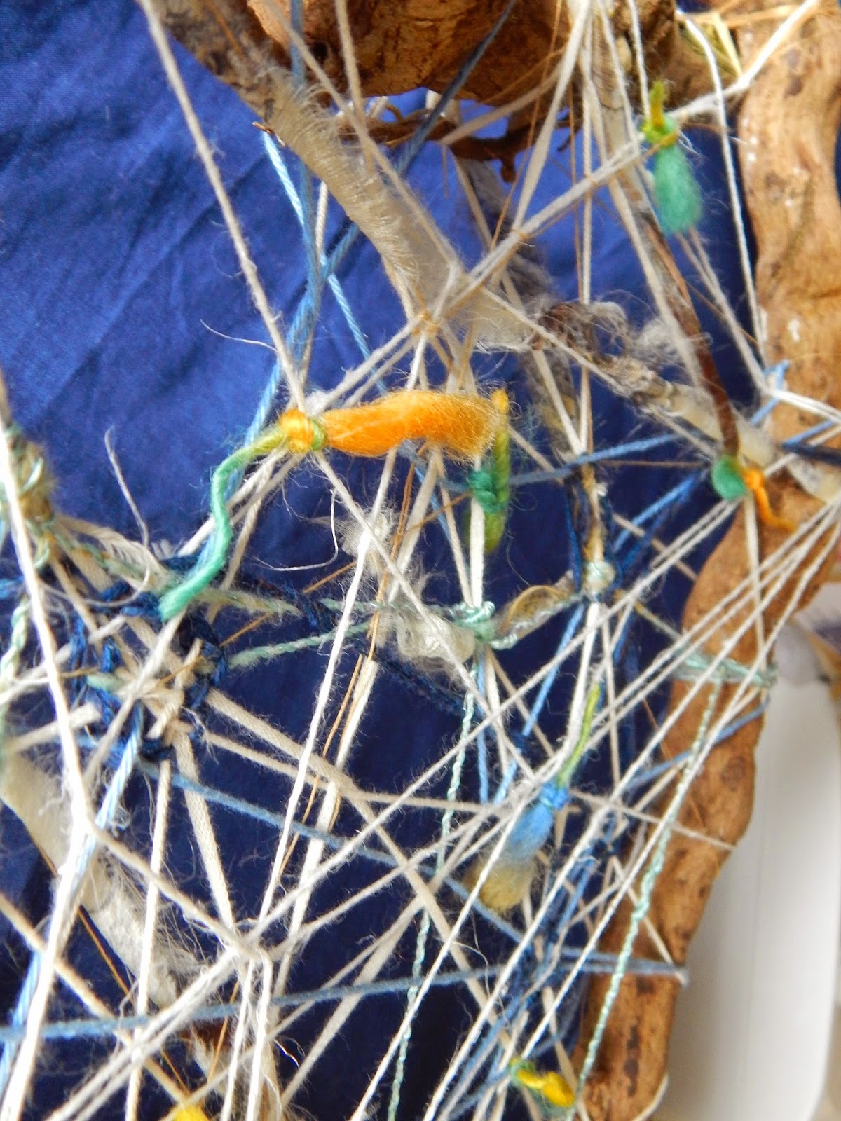
So, the first grid we are asked to work on is a free-form shaped thing. I made a 'triangle' of lumpy roots and chose a range of yarns that came through from a single order I made from Texere yarns - linens (white and gold), greeny viscose and wool (a multi-coloured slub-yarn). The sides of the frame were quite thick and the yarn fine, so there was a sense of three-dimensionality to the whole thing, and transparency of course as I let the yarns stand alone in some places and woven them in and out in others to create a very open structure. The colour tones were quite soft and pastelly, enhanced by the white, and I prefer natural fibres as this aids with the synthesis of the materials - of course viscose is a man-made fibre based on cellulose, but it has a sheen that is a useful contrast to the hairy linen for example.


I put it somewhere where I could walk past it regularly and have come to realise that what I had made first was probably a good start, but not a finished thing. It is a bit too open. Anyway, the book asks us to consider the yarn used, how it relates to the frame and what happens when it crosses and weaves within the work and relates to other yarns. I first applied a number of yarns letting them cross over and under others, but thought there was a limit to what that could be achieved and so added knots of coloured slub yarn to create some 'punctuations' on the surface on one side. I have now decided that the thing is not finished and will be adding areas of 'mass' as the current effect is a bit 'net' like and I think there needs to be patches of 'fabric' as well. The other thing to say is that the overall shape suggests a shield, which would be more enhanced with more solid shapes.


So I wove in islands of a blue wool and cotton blended yarn mix and pulled together some of the looser yarns. In fact over time the yarns has become loose, probably from the movement of the frame. At one point when I looked at it quickly it (unintentionally) almost suggested an Asger Jorn type of image - he was part of the Cobra group of artists in the 1950s and 1960s.


The finished thing

The next grid is a more clearly defined geometrical structure with obvious horizontals and verticals. I made it of tied-together bamboo kebab-skewers so that there would distinct sections that can be worked on individually as well as working with the frame overall. Here it is in progress with the ties yet to be trimmed back and I am working out whether I want to weave in separate rigid parts as well:

 
With weave in progress
 

What is noticeable is that the frame has distorted. I started off setting up mini-warps in one section of the grid and then wove a bit in those, until I looked at the rest of the grid and decided that actually that was not what was expected of the sample, and also weaving on grid-like warps was too close to the tapestry weave in project 9. So I used all manner of yarns to string across the grid, and it looks effective to have the 'traditional' warp over-crossed by diagonals which again have been woven over and caught up into each other. This sample is starting to work quite well - again it looks very much like those 1970s-80s needle woven works. I have used the coloured wools that suggest the green Richter painting but decided to bring out the contrast by using pinks and some golden mustards. 
 

Sunday 15 March 2015

An Object study 1 - a brooch with an Easter Theme, I think

Although I am working on assignment 4, I am conscious that I am not writing in the blog, as I usually wait until there is something worthwhile to put on. So, I thought I might do a visual study of an object, just a small analysis to practice. When I was a student in design history a long time ago this was something we were being trained to do, with deep historical research into a given object. The best example of this in popular literature form I have read is Edmund de Waal's The Hare with the Amber Eyes (2011), but a study of the Bayeux Tapestry by Carola Hicks (2007) is a pretty good review of the life of this famous object as well. I like that type of narrative, following the life history of an object in its cultural context. Some time ago there were some very good TV programmes entitled ' The Secret life of a Master piece' which threw light on certain paintings in this way.

So, very modestly, I will look at an object, a silver brooch, my husband bought for me in Hamburg in an antiques arcade. It is not particularly valuable, it is by an anonymous maker, but it is interesting in terms of aesthetics and iconography.


The object is a small brooch, approx. 4 cm long, it is in silver, unmarked, there is no silver mark nor are there any maker's marks, and there is no provenance to understand its previous ownership. In the photograph it is oxidised, I left it like that as I like the way the blackness waxes and waines in strength with the shiny silver shining through. The design of the brooch enables it to be mounted horizontally on the garment, the pin is set to the top half on the back, allowing the front to be seen as on the top photograph.

You can see from the photograph that the maker has worked silver in its soft state, heated into a series of more or less vertical elements which in most cases end in rounded tips. The silver bends and flows in organic lines, each element next to each other along a kind of horizontal axis of a lines, which flows across the other elements along two thirds of the brooch's length.

When we first got the brooch both my husband and I thought it was purely abstract; I like the flowing lines, the punctuations and the way the relief of the metal has been shaped. There is depth  to the detail and shadows bring out this depth and individual character of each shape, and although each element is attached to the other the separateness of each is developed through the folds and lines of the metal. But it is just this treatment of each element and the unity of the whole that soon got me thinking that maybe there was more representation and narrative to the form than first appears.

In fact, I am now very sure that it is a 'Passion' brooch, that it is working to represent first, the Last Supper:


and on the other side The Passion:


Why the Last Supper, you may ask - well, I think there is a slight triangulation of the composition in the upper edge of the brooch as you can see in the first picture here; there is a taller central 'character' with a number of side characters by this figure's side. The triangular composition of the Last Supper was used by Da Vinci, and many artists placed the Christ figure in the centre during the renaissance. The Passion, the description of the death of Christ on the cross and the descent from the cross with his mother and others mourning his death in the second picture. is the other half of the design. I may be wrong of course, maybe both halves are of the Passion, but either way I am sure it is a religious brooch.

Without needing to be religious I think this brooch is an art work which must have meant something to its wearer before me. I am surprised tat there is no maker's mark as it is so much closer to being an art work than a piece of jewellery only. Maybe it was a commissioned piece for use at a special event or period in somebody's life.

Because there are no marks it is not clear when it was made - it might be from the 1950s, but then it could be later, in any case the way the silver is expressively moulded and abstracted I like to think it is from the 1950s, which is a period I am quite interested in from a design, fashion and art perspective.

Just to contrast this I will show another brooch I have, which is more clearly dateable - a 'vintage' solver brooch I got in Bruges:


I think this brooch can be much more clearly defined in terms of time - likely to be 1960s and it has a maker's mark, so that those in the know, auction houses for example, might be able to identify it. Again it is not very valuable, but interesting for its design and style. Apart from that I will not comment on this brooch much more, it is only here to show that abstraction in silver has been used in a more pure state and freely while the other works with the ambiguity of shapes creating suggestion and allusion to something else. It is interesting to think about how differently abstraction can be used, how forms can tell stories or be enjoyed for the sake of their own being.